It All Started When...
I was watching the niche show “Search Party” on HBO. I fell in love with the show and after finishing the first season I frantically texted all my friends if they were watching the show too. After a couple days a free friends texted back that it was on their list but hadn’t started the show. With this I stuck to convincing my friends to watch the show yearning to talk to someone about it. I realized I wanted to do something about this. How could find which of my watched the same shows that I do so I could talk to them about it?
My Role
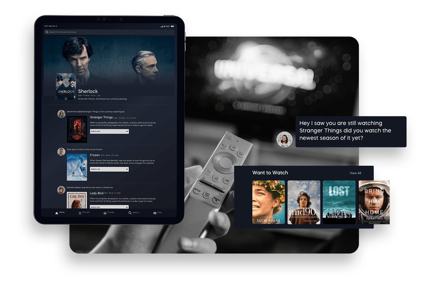
This app idea came to me as I was trying to find people to connect with over TV and entertainment. I mean watching TV seems simple right? Though the television is a normal part of the modern human day, it has changed drastically within the decade. Why? The content being produced and available to us is now endless. There’s niche shows as well as culturally significant shows, indie movies and blockbusters all at our fingertips. How can we stop feeling buried by all the content? That’s where Seen It comes in. An app that lets you track the entertainment that you consume and connect with friends over the shows you watch.
After doing research I found that most people felt the same as me. Users were craving a way to connect with each other over entertainment. I completed the idea, research, design of this project! Basically it's my pride and joy and I am currently looking to work with developers to get it out there for the users!.
ROLE
UX Designer
UI Designer
Creator
TIMELINE & OUTPUT
Responsive app design
2 Week Sprint
TEAM
Me!
(A designer, creator,
entertainment watcher,
and passionate about
creating an app that
will connect users together!)
The Problem
With all the niche entertainment shows out there, how can I help people connect over similar shows?
Let's Get Started
I researched over all of the app stores to find if there is something similar to this app but I never found exactly what I wanted. Apps like IMDB let you add shows to your watch list but never had the crucial social element that I wanted. After conducting this research I was ready to design it myself. I rolled up my sleeves are got started. First step… research.
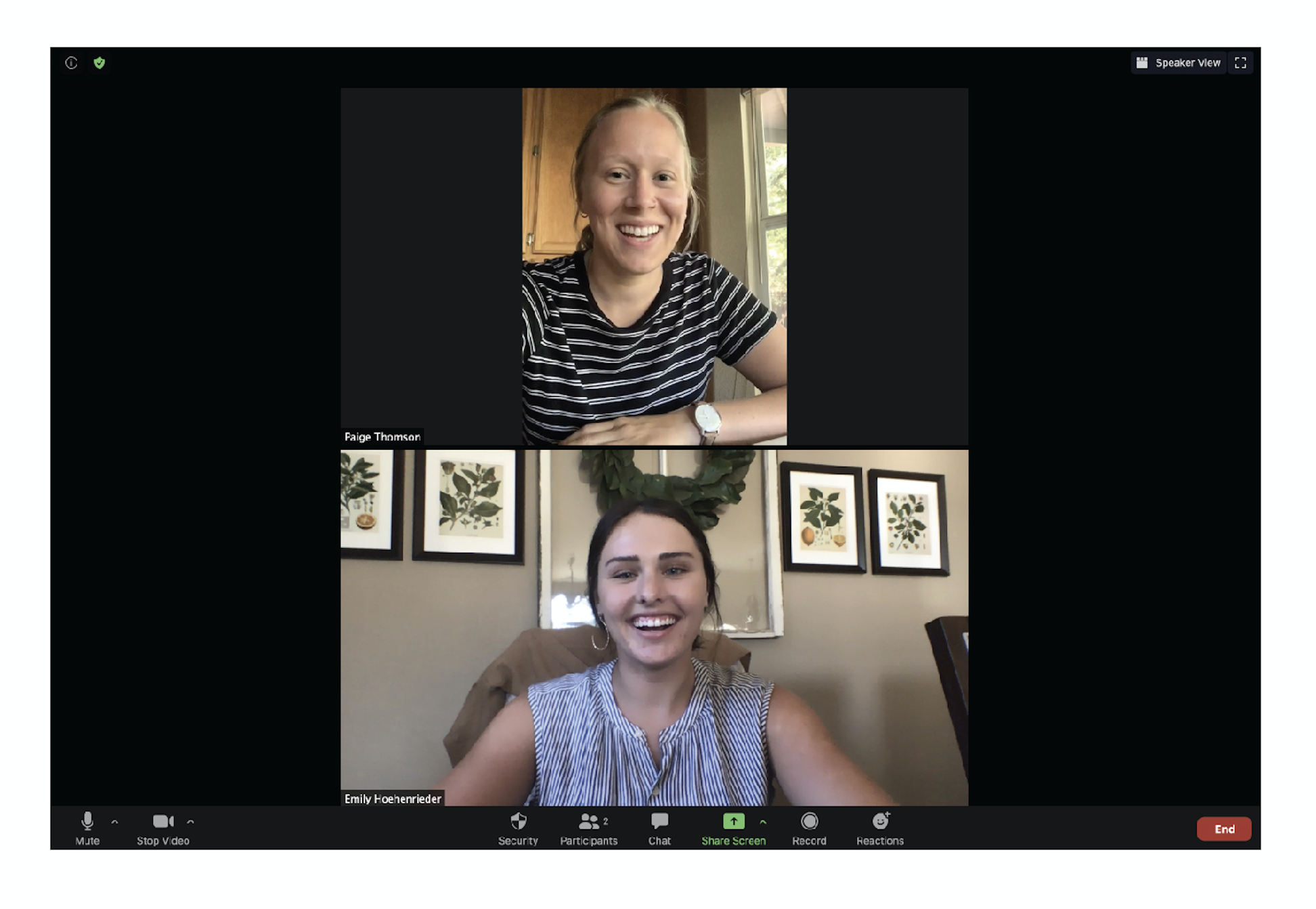
User Interviews were completed over zoom in 2020 during the coronavirus pandemic. Because of the inability to conduct
interviews in person, I reached out online to find users to
interview over zoom. I conducted 5 zoom interviews.
Research
Relationships with Entertainment
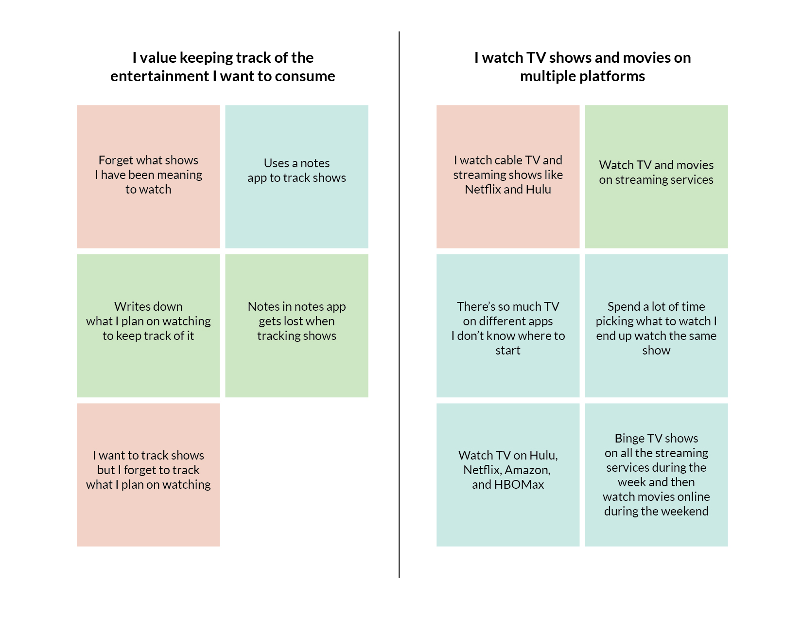
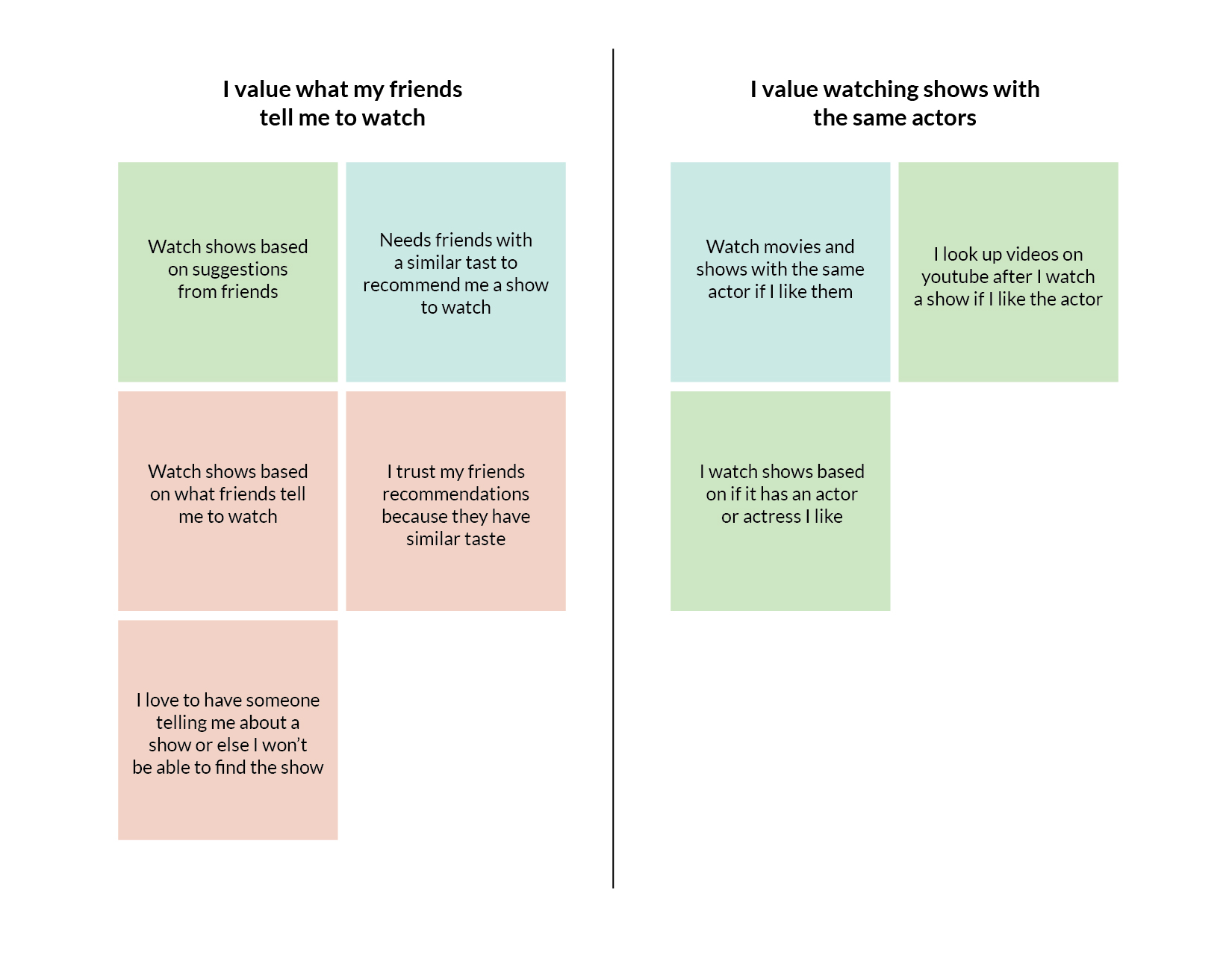
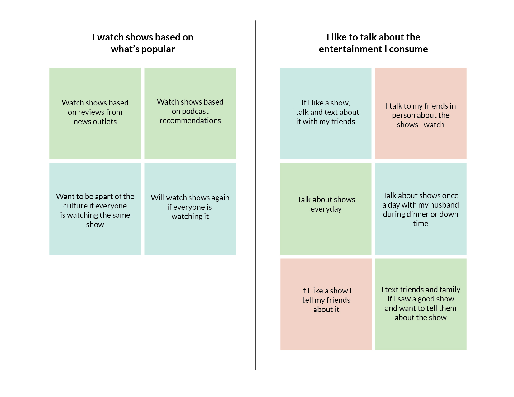
For research, I wanted to go right to the source, the users. To get the best information from potential user I decided to conduct interviews to better understand the users relationship with consuming entertainment. My main goal in conducting user interviews was to better understand why people watched certain shows and their relationship with entertainment outside of just watching it on TV. I asked users “How do you choose what shows you watch?”, “How often do communicate (in person or text), with friends about shows you watch?”, “What are some issues that arise when watching and talking about entertainment?” In order to fully synthesize the research from the interviews I mapped them in an affinity map to find patterns of what users value within the information I gathered.
Gathering Insights from Research
In order to fully synthesize the research from the interviews I mapped them in an affinity map to find patterns of what users value within the information I gathered.
“I get recommended so many shows from friends I always forget what they are. I find that my friends and I talk about shows we watch all the time.”
— Quote From Interviewee
Define
Expanding the Focus
After the interviews I realized that users felt two different ways. One was that users like to talk about entertainment. This was my hypothesis going into the project as I also was in need of a more efficient way to talk about entertainment with friends. What I wasn’t expecting was how much users wanted to track shows they want to watch. They explained that there was so many shows on so many networks and streaming apps that they craved a way to track which ones they wanted to watch or were recommended by friends. This led me to realize that my project would need to achieve two objectives.
Users need a way to track shows and chat with their friends about shows because users want connect with their friends over shows they watch.
How Might I...
Using the problem statement as a guide, I created a list of “How might we…” questions to help me better align my user’s tasks and goals. These “How Might We” questions pose solutions to the problem statement listed above that would help me track possible design solutions the user needs.
Track the shows we want to watch
Talk to friends about what we watch
Search for shows that we want to watch
Find shows that our friends watch
Connecting with a Friend over a Show
Meet Sophie the Show Lover

Once I concluded some solutions from my depth research, I synthesized my key findings from all of the research into the creation of two user personas whose goals, needs, and pain points would help in guiding the rest of the design for the project. The first user I decided to focus on was someone who would use the app to connect with friends over certain shows they watch.
“I love TV and watch it every night. I just finished Search Party on HBO Max and need to talk about it with someone but I don't know who watches the show".
Goals
To find what friends watches the same shows as Sophie and be able to start chatting with them about it.
Needs
To see what her friends are watching and chat about it with them. Sophie also needs to be able to track the shows she watches
Pain Points
Sophie currently uses the notes app to keep track of shows and is limited by the organization in the app. She also doesn't know which friends watches the same niche show as her and is yearning to connect with people of shows.
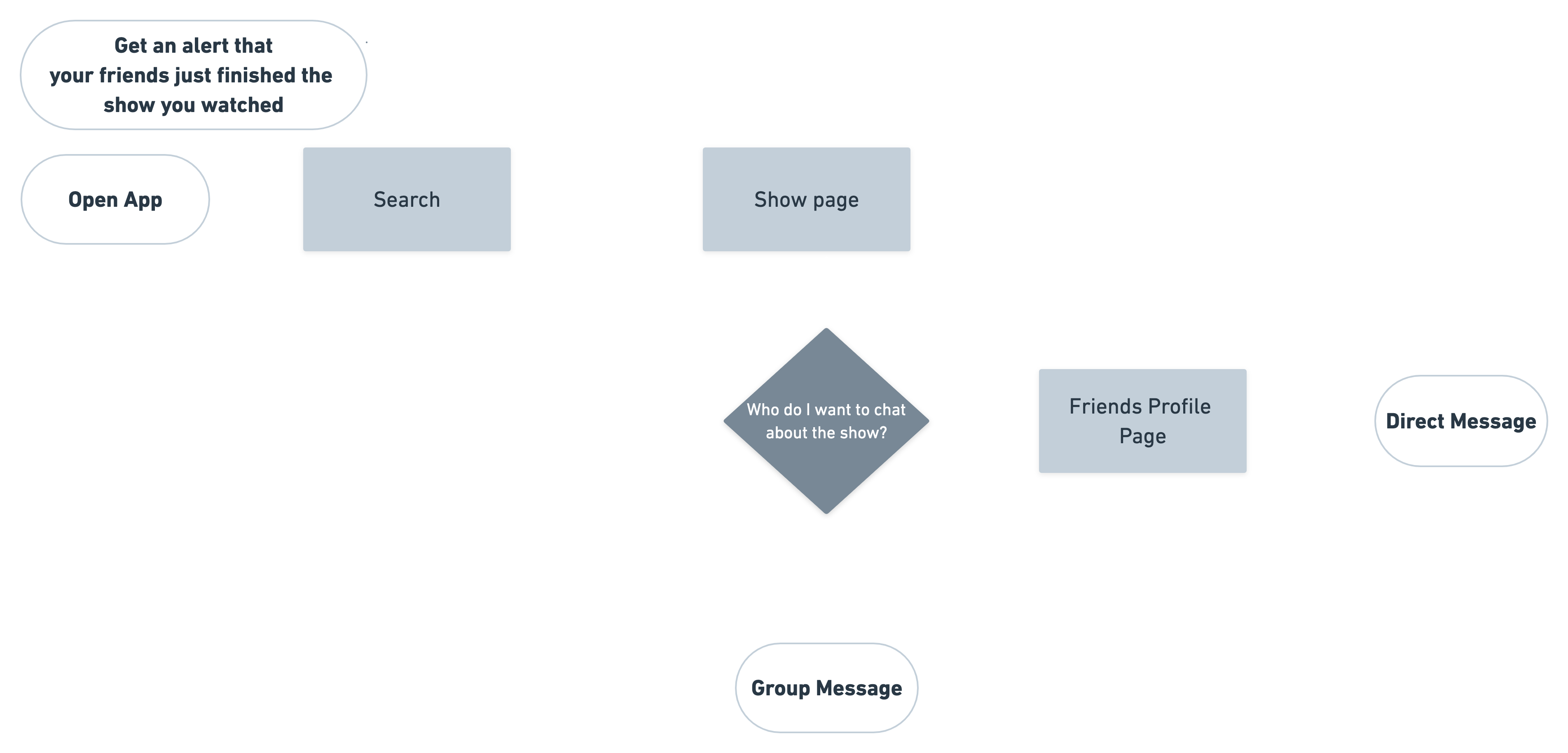
From the user personas I developed two separate user flows that solved the needs and goals of the users. For Sophie the Show Lover, she needs a way to chat with friends who watch the same shows as her. A feature that would appeal to Sophie the Show Lover would be an alert that notified her when a friend finished a show that was in her “Have watched” list. This way she could easily start a conversation with her friends over similar TV shows and movies that they watch. She can also start a chat within the app on her friends profile or a page that features the show or movie where she can see which friends watch the show. The green boxes in the flow represent a page in the app whereas the purple diamond represents a decision the user makes. The white pill shapes are the start and end points for the user when using the app.
Determining
What to Watch
Overwhelmed Oliver

The second user I decided to focus on was one that was overwhelmed by the amount of shows and would use the app to determine what to watch.
"I only have a little bit of the day to choose what to watch and with so many shows out there I am overwhelmed and spend too much time looking for a show"
Goals
To decide what to watch quicker and remember what he is recommended to watch by friends.
Needs
A way to organize the shows he wants to watch and see what shows are playing on which platform. Oliver also needs a way to see what friends are watching for inspiration.
Pain Points
There is so much TV Oliver has a hard finding what to watch and he is always forgetting what people recommend him to watch. Oliver is overwhelmed by all content out there.
For my second scenario flow I wanted to find a way to fulfill the needs and pain points of Overwhelmed Oliver. His biggest goal is determining what show to watch. Oliver can do this by checking his own profile page to see the shows he has already watched or by seeing what is on his friends page so he can get ideas on what to watch.

Ideation
Sketching Design Solutions
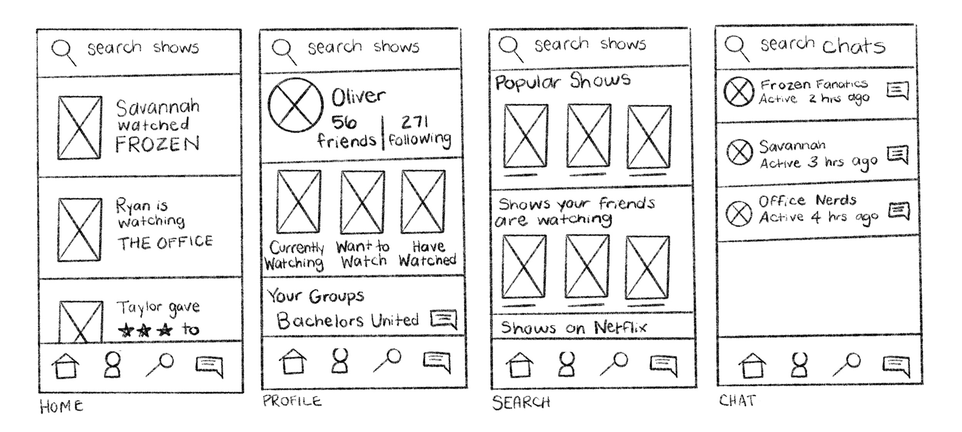
I used the scenario flows I created for my two users to develop the pages for the app. To develop my design I started by listing out all the pages and some specific needs that have to be on each page. For instance, a profile page had to have the lists of what the user was tracking as well as the users names and friends. After thinking through the necessary items that should be shown on each page I sketched the design using paper & pen.
Prototype, Test, Iterate, Repeat
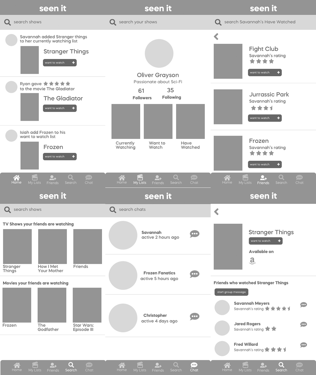
Based on my research I design mid-fi prototypes to test each user flow. I then tested these protoypes. User testing uncovered some issues and challenges in each test. Due to time constraints, I implemented the changes in high fidelity to make sure a timely delivery.
Testing "Chatting
About a Show" User Flow
For the first round of testing I tested the first scenario flow of finding a way to chat about a show. I asked users to complete the following scenarios:
- You just finished a show and want to chat about it with your friend Savannah
- You just finished a Stranger Things and you want to start a group message with all of your friends who watch Stranger Things
Results
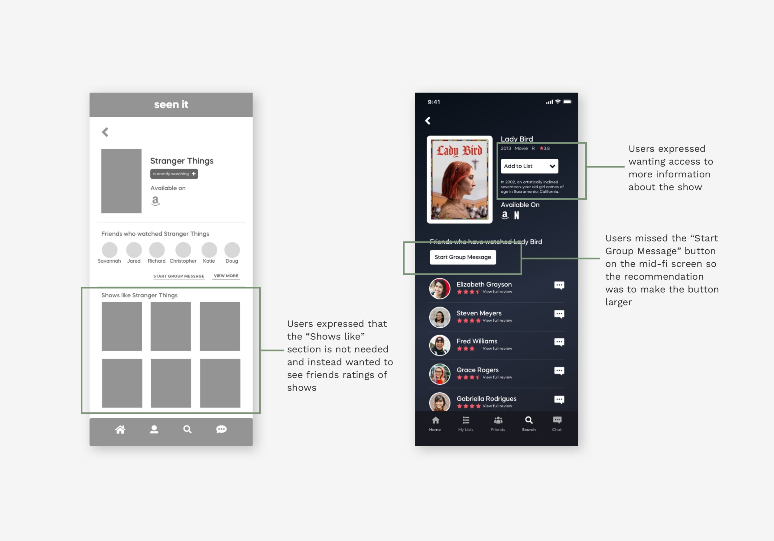
Many users became confused and frustrated over how to navigate the navigation bar on the footer of the screen. Users also had a confusing time figuring out how to start the test and where to click first.
“I think this icon [chat icon] means more which means my want to watch list would be there”
Testing "Determining a
Show To Watch" User Flow
For the second round of testing I decided to test the second scenario flow of determining a show to watch. I asked users to complete the following scenarios:
- You don’t know what to watch and you want to see whats on your what to watch list
- You don’t know what to watch and you want to see whats on your friends what to watch list, click on want to watch and add it to list.
Results
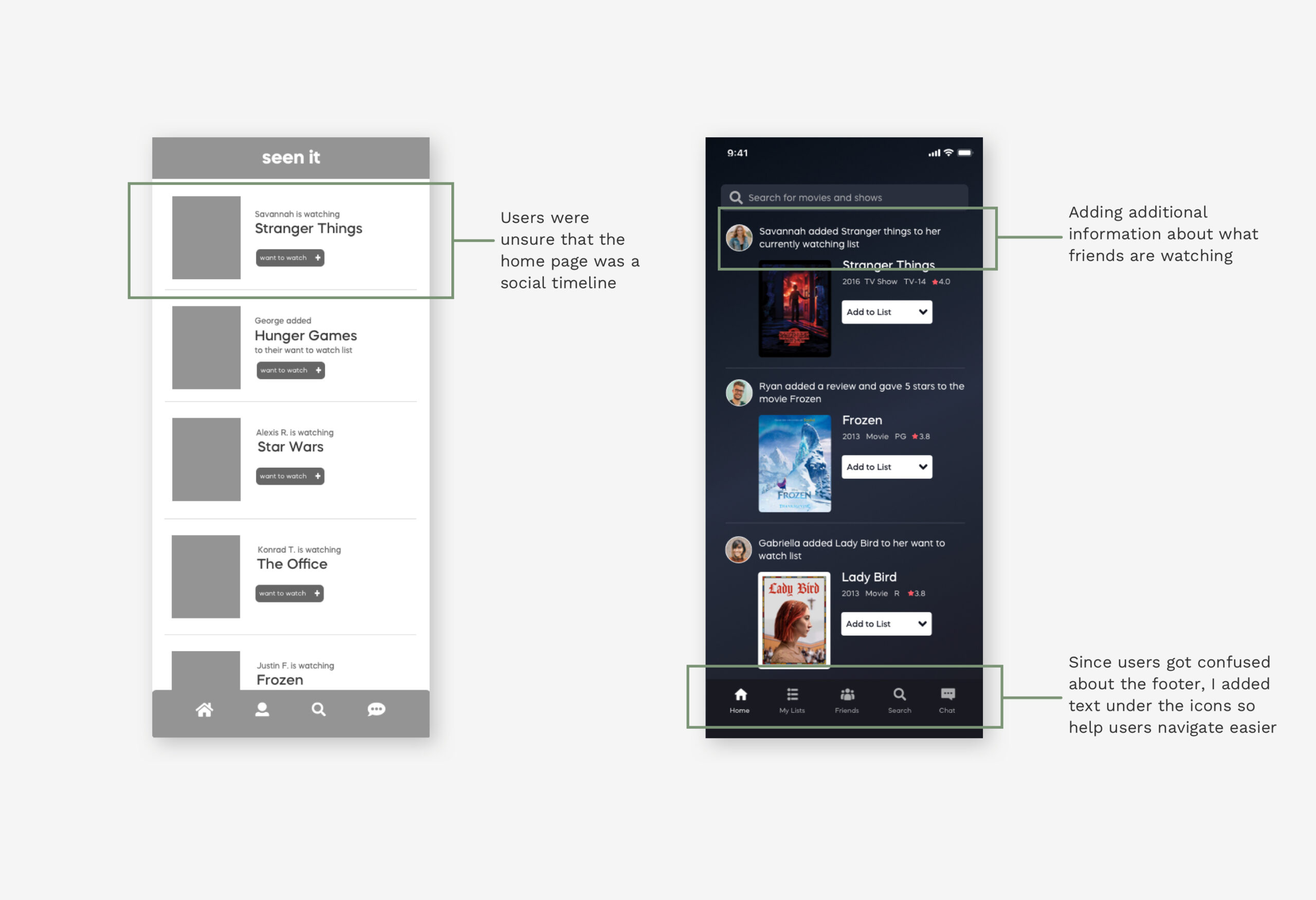
Users were unsure that the front page looked like a social timeline. After following up with questions, users said that they would like to see more information on the timeline such as what friends rate a show.
"I'd like more information from my friends like
what they rated a show.”
Hi-Fi Prototype
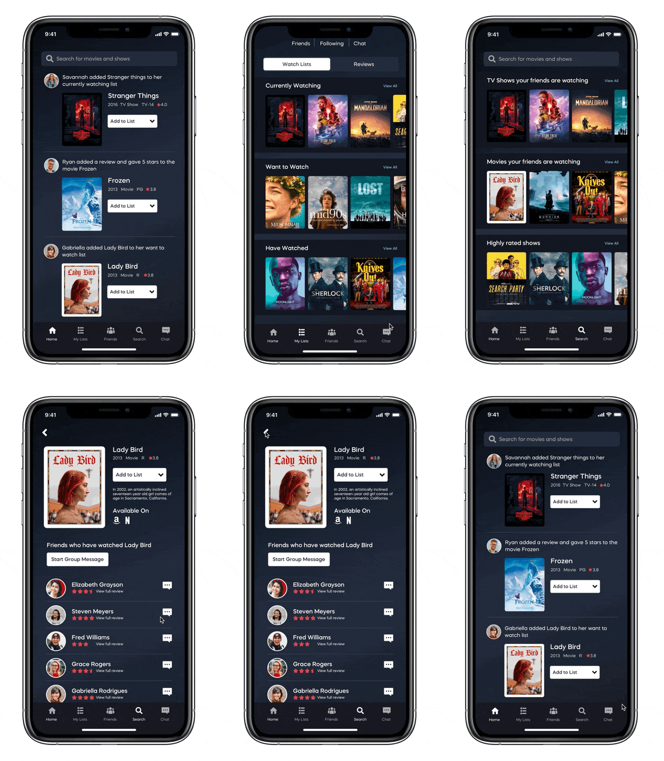
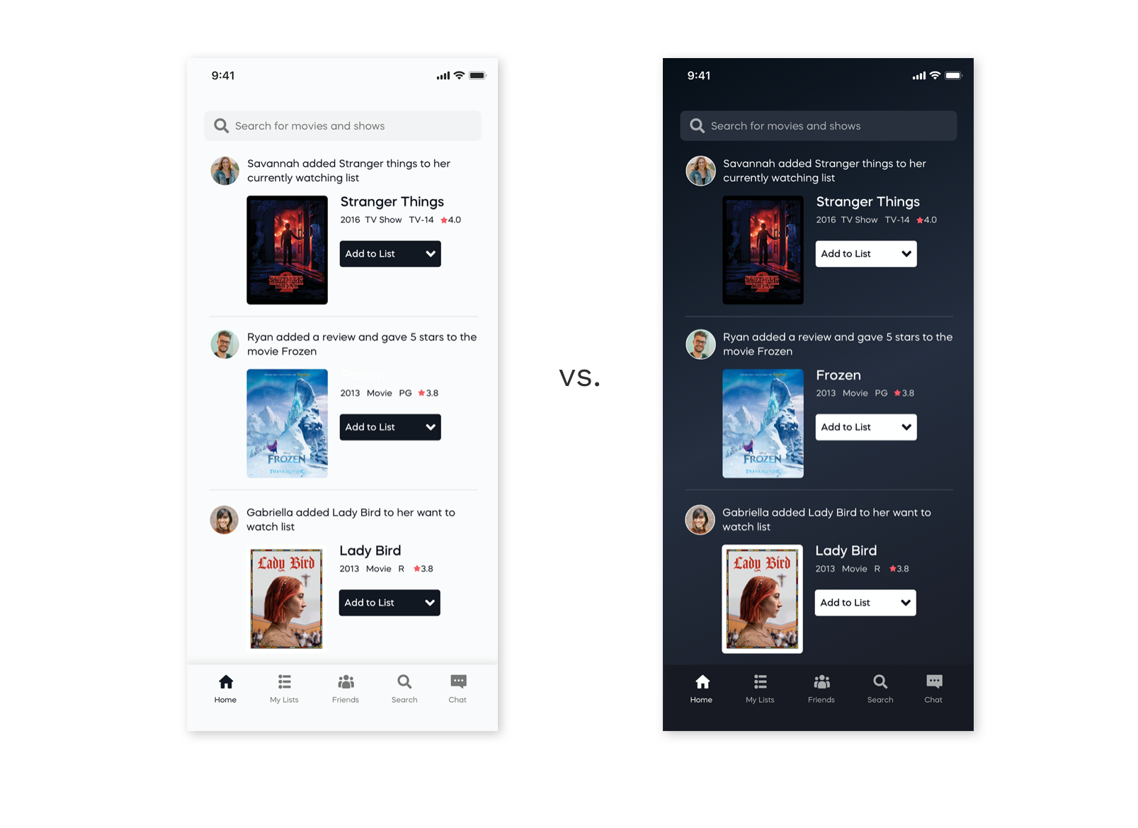
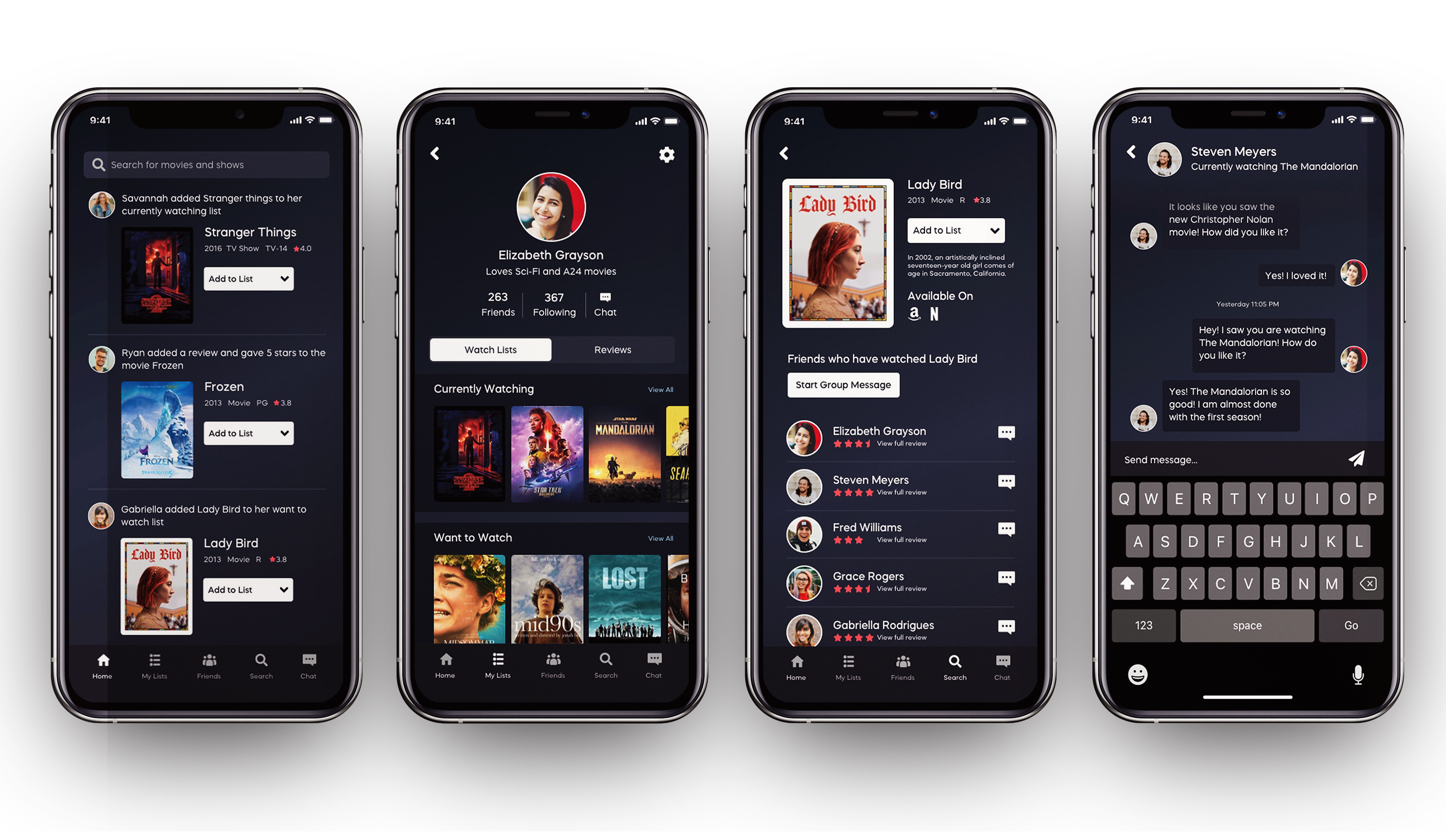
Hi-Fidelity screens for tablet and mobile were created using Sketch. I then uploaded my screens, symbols, text styles, and colors to Zeplin for easy hand off to developers. A design decision I made was to create the app in dark mode as the app would mostly be used while watching tv or movies. Dark apps help not to distract the user with too much light while sitting in a dark room.
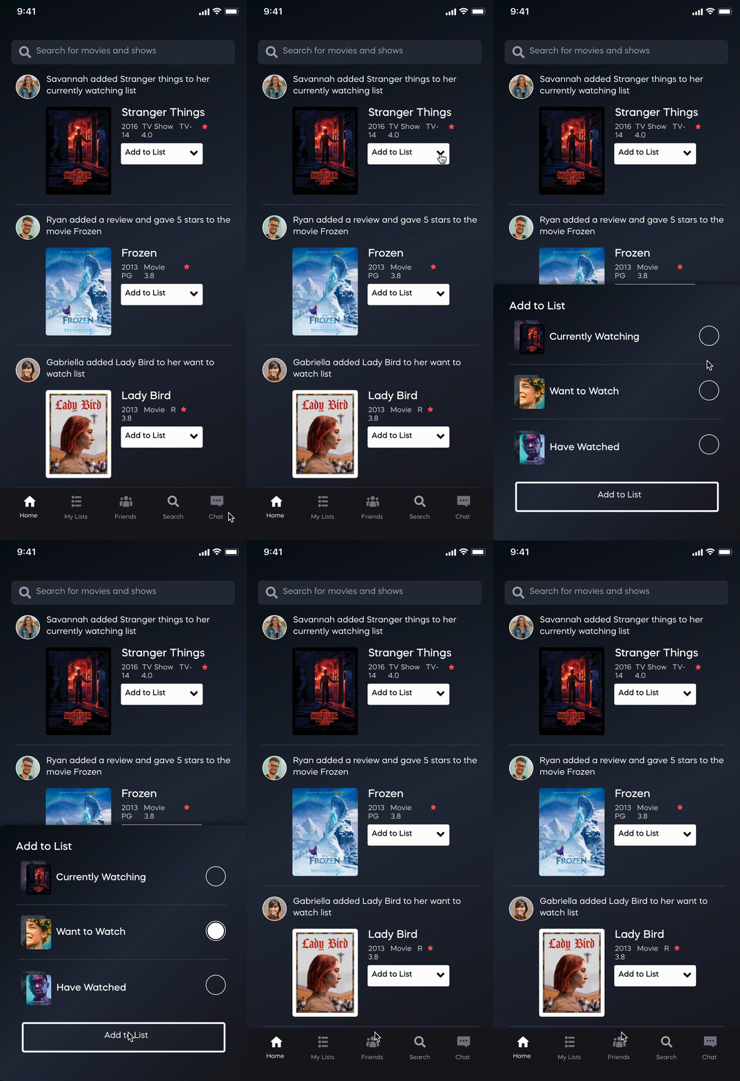
Animation for
"Add to List" Button
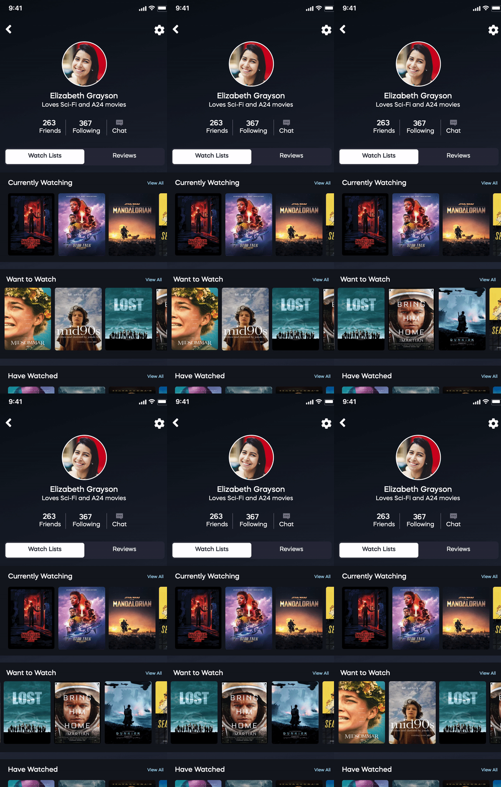
Slider Animation for Watch Lists
Light Vs. Dark
Hi-Fidelity screens for tablet and mobile were created using Sketch. I then uploaded my screens, symbols, text styles, and colors to Zeplin for easy hand off to developers. A design decision I made was to create the app in dark mode as the app would mostly be used while watching tv or movies. Dark apps help not to distract the user with too much light while sitting in a dark room.
Mobile to Tablet
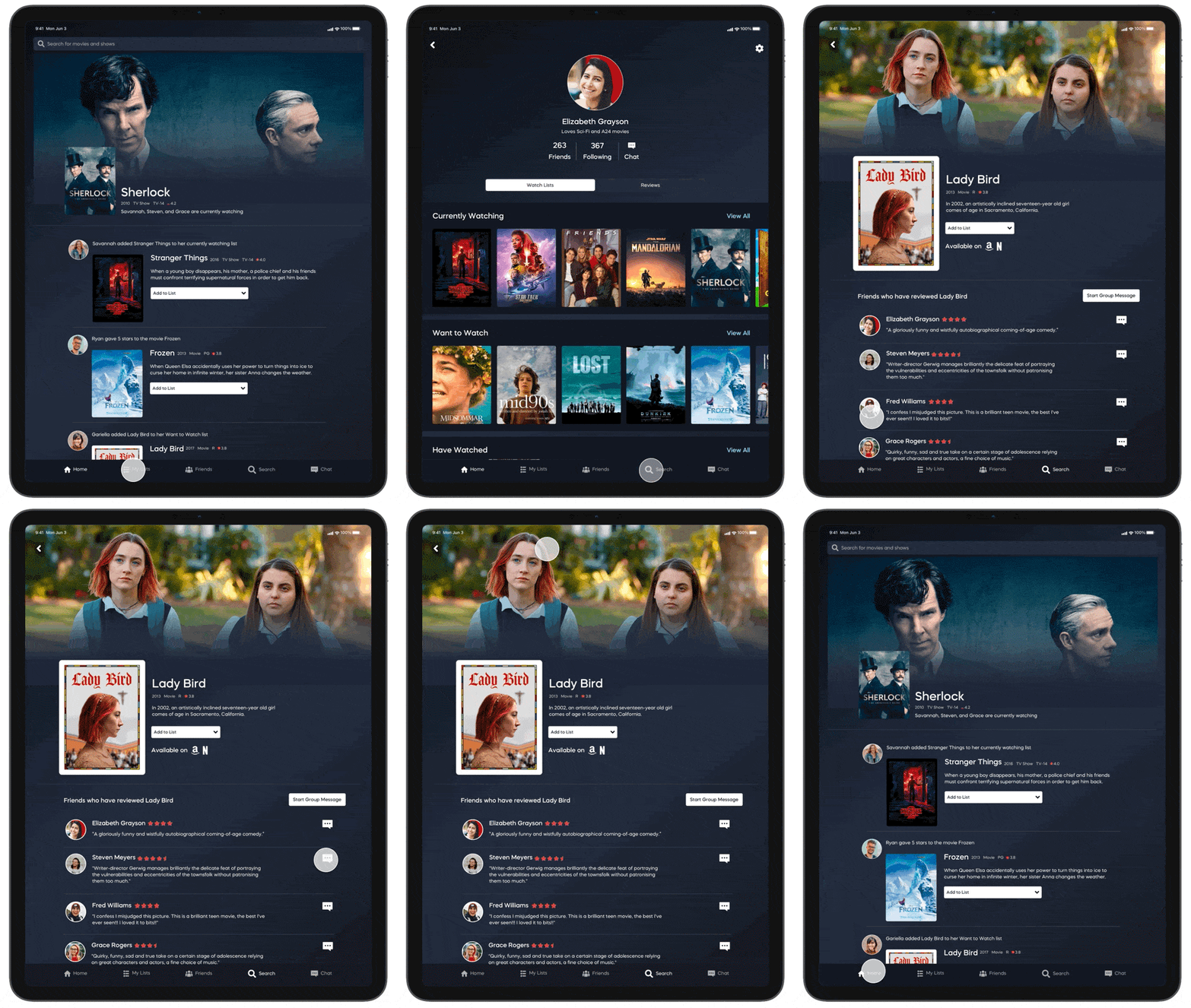
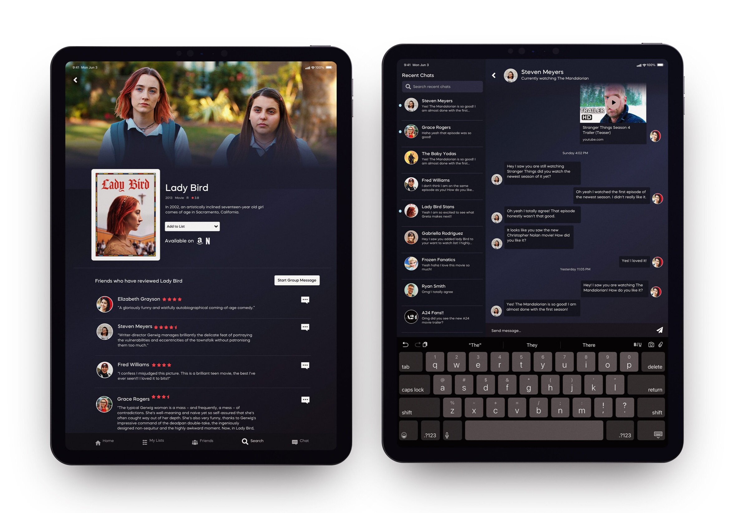
After designing the mobile screens, I then designed the tablet screens modifying the assets and symbols for the larger iPad screen. While interviewing users in the beginning a lot of users expressed that visuals are important in determining a show they want to watch. Designers spend a lot of time designing posters that emulate the show they are advertising so I wanted to give proper real estate to those visuals. With more room on tablet devices I saw I had the opportunity to increase the number of visuals a show can receive. This shows why I added a large marquee to tablet show page to give users more insight into what the show is about.
Reflections and Next Steps
This project was such a thrill to work on. I loved being able to talk to people and get to know users during the research phase and flexing and learning new UI techniques during the design phase. Next Steps for this project would definitely be testing more designs and creating different user flows that users may take. I would also love to get this out there and on the app store and I am currently looking for developers to develop the app.
Chat with me! 🤙emily.hoehenrieder@gmail.com
©2020 EMILY HOEHENRIEDER
This website was made with love and many
hours by Emily Hoehenrieder for Emily Hoehenrieder.

