About Kuda Vana:
Empowering children to Thrive
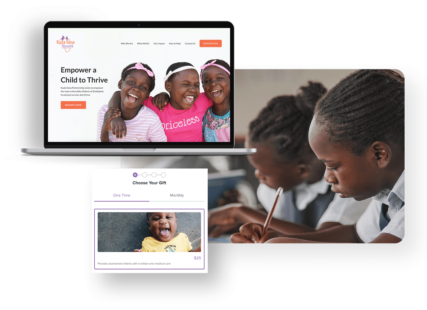
Kuda Vana Partnership is a nonprofit with a mission to empower the most vulnerable children of Zimbabwe to not just survive, but thrive. The Kuda Vana staff provides whole-person care to each child, including love, nutrition, security, healthcare, education, life-skills and spiritual and emotional guidance - enabling them to live more independent, dignified, and enriched lives.
Kuda Vana is a one-person shop stateside (everyone else is in programs in Zimbabwe!) and they desperately needed a revamp of our website in order to better showcase the incredible impact our supporters have on vulnerable children.
Small Team, Big Mission
Working with Kuda Vana was a great process. They are a unique nonprofit where most of their staff is in Zimbabwe directly helping kids. With that being said, our client was the only staff stateside. She was responsible for the design, development, and content on the website while also working with Kuda Van only part time! As UX designers we are taught to have empathy for our users, but this empathy also extends with to the clients we work with. We wanted to develop something for our client that was easily integrated and maintainable so she could focus on working on the mission of Kuda Vana.
ROLE
UX Designer
Web Designer
TIMELINE & OUTPUT
Responsive web design
3 Week Project
TEAM
3 UX Designer
Clients
The Problem
Kuda Vana needs to increase site user engagement and numbers of donations through
1. Content organization
2. Site design
3. Improvements of the donation flow
Research
Relationships with Non-profits
Our first step in accomplishing the goals of the project was to understand how people interact with nonprofits. We sent out a survey to 25 people. We wanted to figure out why people donate to certain nonprofits and what is important to them when they are donated. This information would help us with finding a solution to improving the donation flow as well as influencing the site and organization fo the site.
51.3% of responders wanted to see the impact of their donations.
91.3% of responders needed to feel personally aligned to a nonprofit.
“I would like to see personal stories about the children & impact of my donations. That is why transparency is crucial, I would love to see a specific break down of where my money is going.”
— Quote from an interviewee during user interviews
Transparency is Paramount
From the user interviews we conducted affinity mapping from kew phrases from the user. From affinity we were able to gather insights on what is important to the user in terms of donations to nonprofits.

Gratitude goes a long way - users would like to receive thank you notes.

Users want to feel personally aligned to the organization.

Users want specific breakdowns of their donations.

Users will give recurring if they are small & they see their impact.
How to Establish Trust
After working on the research and insights from that research we wanted to take the information and needs we developed and write problem statements that would address the needs of the users. Looking back at our research we found that users value trust in interacting with a nonprofit.
- Showing where the money goes
- Cleaner, simplistic navigation and trustworthy site design
- More options of donating so the donation can fit their financial stability, but also still provide substantial money to Kuda Vana
The Established Donor
We chose users for this project based on existing donators and potential donators. Currently Kuda Vana donators lean older. They are likely to sponsor a child and be already familiar to the mission and programs of Kuda Vana Partnership.
“What makes us the happiest is seeing
the kids thrive, and being supported”
MOTIVATIONS
- Believe every child should have a safe, loving home environment.
- Want to read the blogs & newsletters in their spare time.
PAIN POINTS
- Not the most tech-savvy
- Want to see more information for personal impact
The New Donor
The second user persona we created was for a potential donator to Kuda Vana. One of our goals in getting more engagement in donation was to appeal to the millennial. Millennials have different expectations and motivations when donating to nonprofits and we wanted to take this information in account when creating our designs by keeping in mind our users through our millennial user persona: Lauren.

“I care most about the authenticity of a
non-profit. I want to know their mission &
my values align.”
MOTIVATIONS
- Prefers a genuine, small-scale non-profit
- Contributions are making a real impact
PAIN POINTS
- Not financially stable to guarantee long-term support
- Values easy & accessible info
Addressing User Motivations
Getting into the mind of potential donors through user personas was greatly useful for establishing empathy and understanding what motivates them to donate. In moving forward with ideation on the project we wanted to always keep our users and their motivations for donating in mind so that every design element we decided on addressed these users. The first way we wanted to figure out some ideations for the app was to create some “How Might We” statements. These statements start to solidify the possible ways we can address the motivations and pain points for the users.
How might we drive monthly donations rather than a lump sum?
How might we show more communication on where the donor’s money goes in order for all donors to QUICKLY understand?
How might we communicate to the user that they are personally affecting this non-profit with even the smallest donation amount?
The Solution
Working on some design studio drafts and ideating some solutions to the “How Might We” statements, my team decided to focus on a few key design and flow solutions that would address the user motivations and the objectives from Kuda Vana.
By simplifying the navigation and adding more visual aesthetics to the home page and to the donation flow, the user will be able to gain trust in the site in a professional website and knowledge in Kuda Vana, before donating.
By adding more monthly payment options the user will be able to quickly choose a donation amount that supports their financial stability
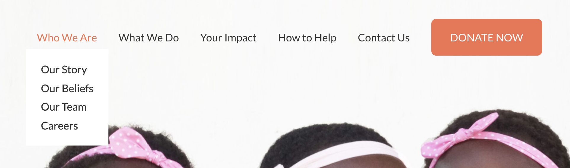
Intuitive Navigation
The rest of the project was divided into the three objectives we wanted to solve pulling from the research and keeping our users in mind as much as possible. We started with card sorting to find what users intuitively grouped headers together.
Card Sorting helped us working on the navigation grouping. We tested our UX writing with a simple navigation prototype to see where users could find certain items. This helped in confirming our navigation titles for redesign.
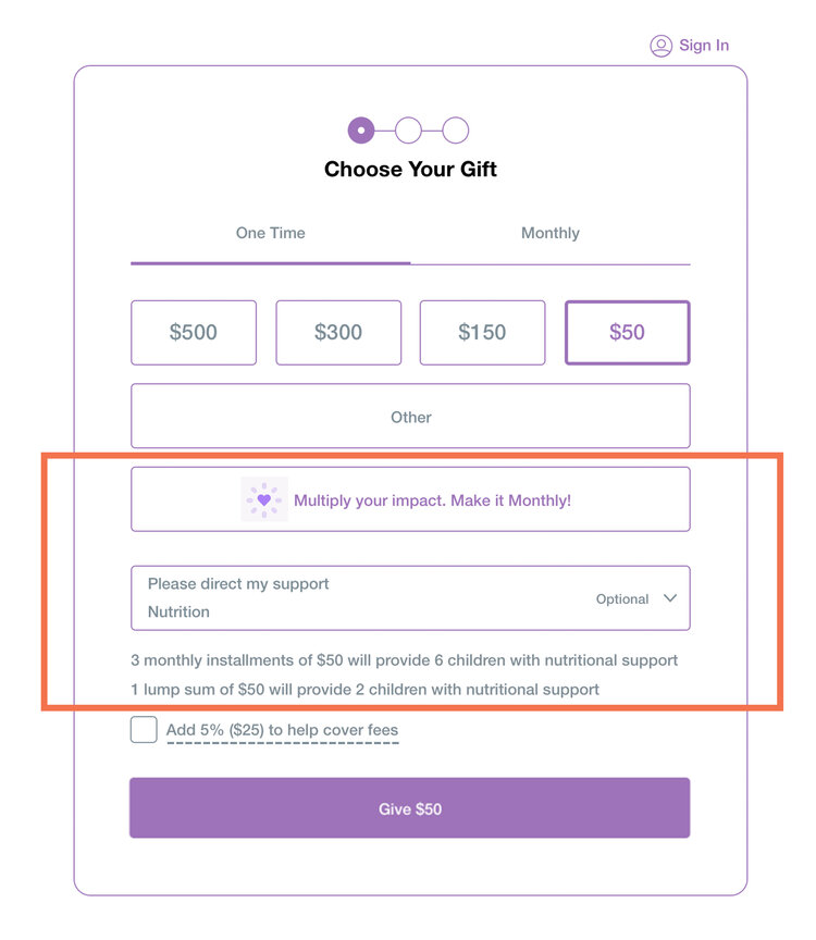
Encouraging Recurring Donations
For the donation flow we wanted to establish trust while users were donated as well as offering users different donation amounts so they can choose which one fits their financial stability. Another important part of the flow was establishing monthly donors. We solved this by creating nudges for users to donate monthly.
Telling a Story through the Home Page
The problems we wanted to solve on the home page were establishing a quick and clear mission statement as well as establishing trust in Kuda Vana with professional site.
We solved the problems by telling a story through our home page and answering questions users might have on the home page as well as give a quick highlight of what users can expect on the site and in Kuda Vana.
Home Page Sections to Mimic Nav
We did we full site user testing to get an understand of how our users felt about the site. We found that users appreciated the site redesign as it felt more professional and they were more inclined to donate to the site. We also found that users performed successful tests in donating and going through the donation form. On the home page we had some users request that the sections title mimicked the navigation. We changed the home page sections so they directly worked with the navigation and users were better able to orient themselves on site.
A Full Site Delivered
Kuda Vana has only one worker stateside so from the beginning we wanted to make sure we could delivery as much as we could to our client. We were happy to deliver a full site to our client and continuing to work with them on developing the site and making it live.
Chat with me! 🤙emily.hoehenrieder@gmail.com
©2020 EMILY HOEHENRIEDER
This website was made with love and many
hours by Emily Hoehenrieder for Emily Hoehenrieder.