Case Study – Financial Technology Mobile Application Feature
Providing Progress Visibility in Loan Assistance Programs
My Role
On this project, my responsibility was to design the user experience for the mobile application. This involved:
- Collaborating with research to identify key questions for users.
- Iterating based on feedback gathered during research.
- Adhereing to a robust and historical design system
- Working closely with a scrum master and ux researcher to stay on top of tasks
- Conducting weekly stakeholder reviews of design
- Ensuring a seamless handoff for both iOS and Android applications.
CLIENT
Discover Bank
ROLE & COMPANY
Sr. UX Designer
Kin and Carta
TEAM
10 Stakeholders
1 Scrum Master
1 Sr. Designer (me)
1 UX Researcher
Team of ios/android developers
OUTPUT
Mobile Appplication
What are the Loan Assistant Programs at Discover?
A challenge in this project was that their were many loan assistant programs. We wanted to create a consistent design for these programs while addresses the quirks and intricacies of each program
Short Term Assistance - Temporarily make lower payments that will gradually increase in the last 3 months of the program to return to your standard monthly payment amount. The amount past due will be delayed to the end of the loan term. Then your account will become current.
Long Term Assistance - Make lower payments by extending your loan term, plus become current after program enrollment.
Payment Deferral - Become current after making 3 consecutive standard monthly payments or the equivalent within 3 consecutive months. The amount past due will be delayed to the end of the loan term.
Project Overview
Problem
Currently, Discover users cannot track their progress in loan assistance programs on the mobile app. Since most users enroll in these programs only once, they often feel confused about how the programs work and where they stand.
Solution
Members need a simple way to track the progress of their loan assistance program online alongside their account details. They also need a clear onboarding feature that explains how the program works and what type of progress they’re viewing.
Outcome
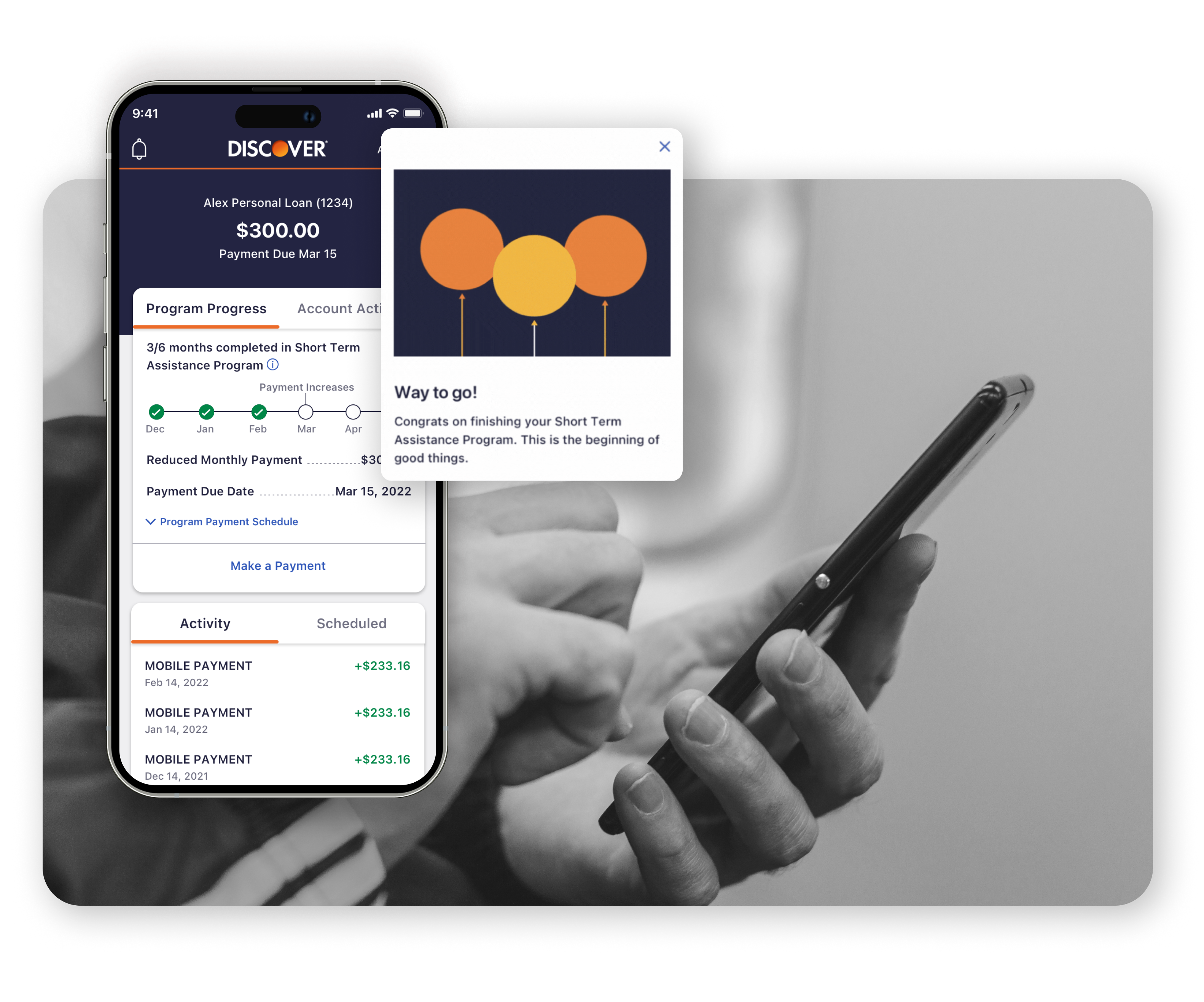
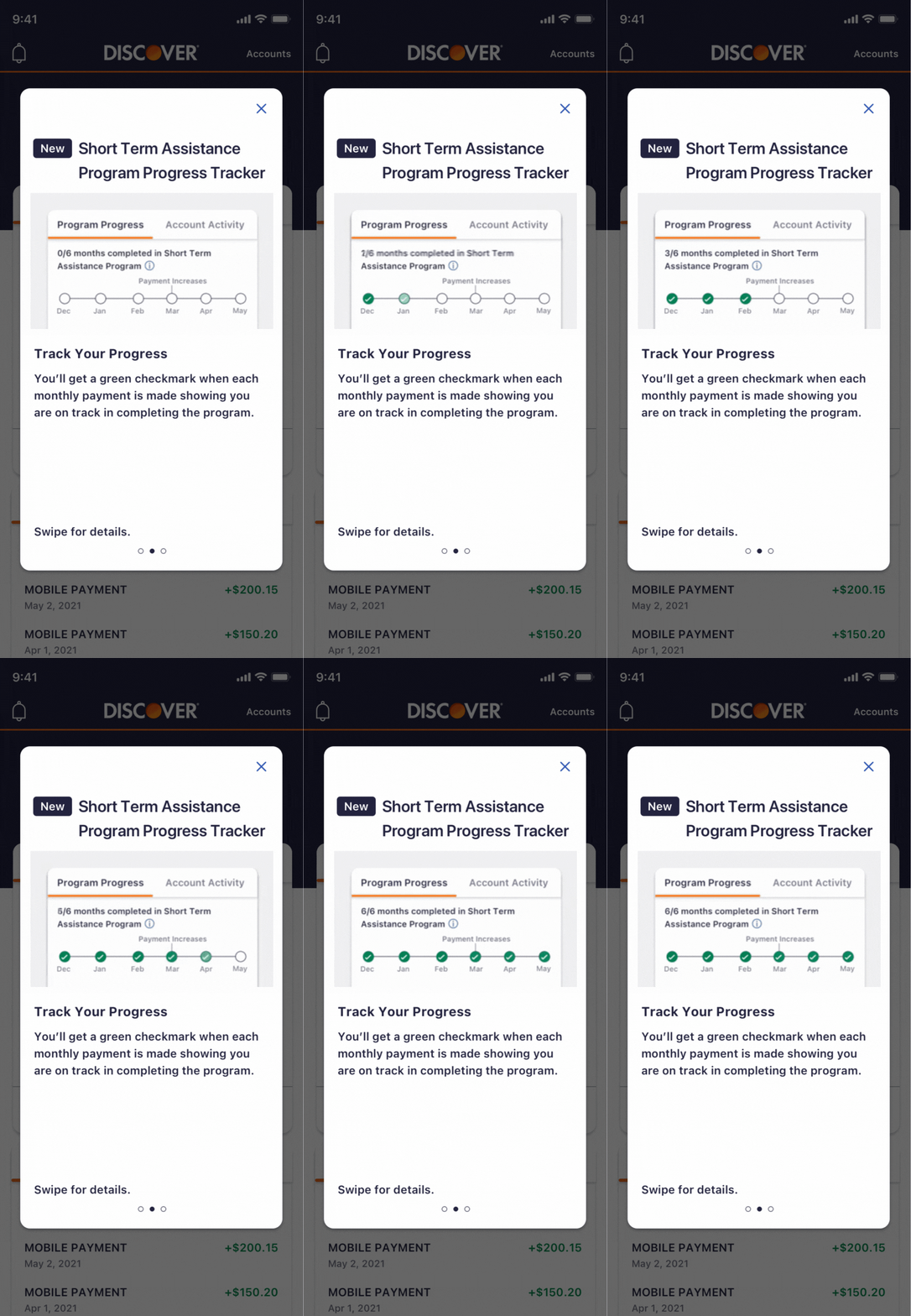
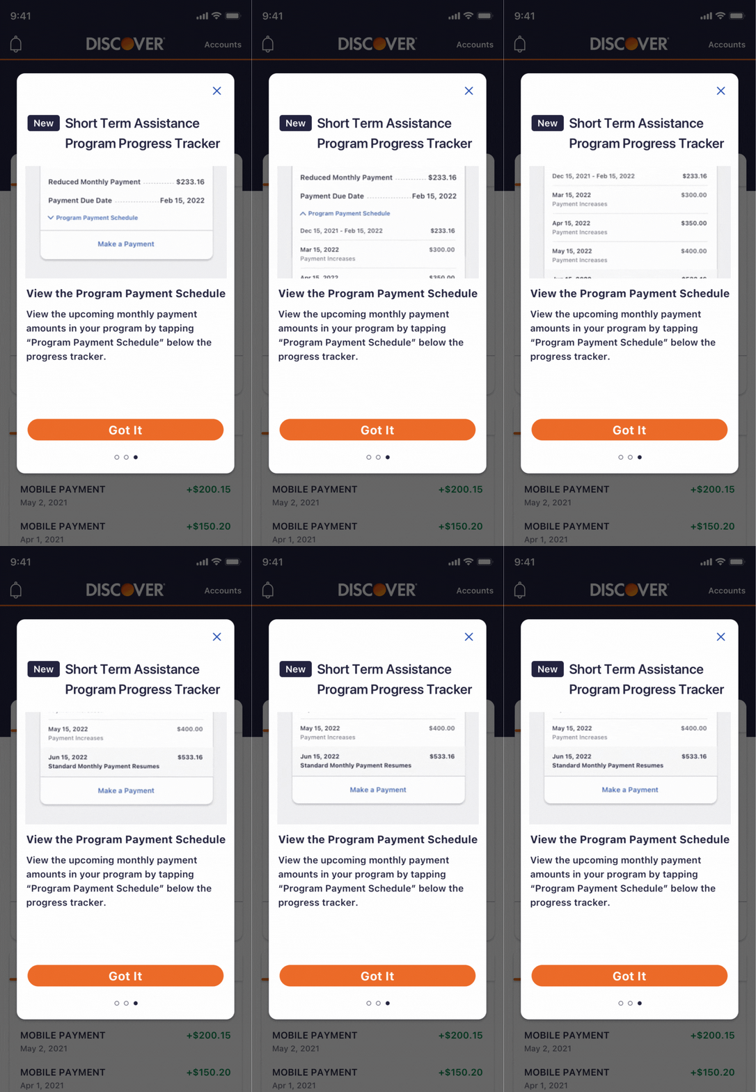
A designed feature that guides users through their assistance program onboarding with simple GIFs, enables easy progress tracking, and motivates them to complete their program.
Discovering How Users' Interact with Loan Assistance Programs.
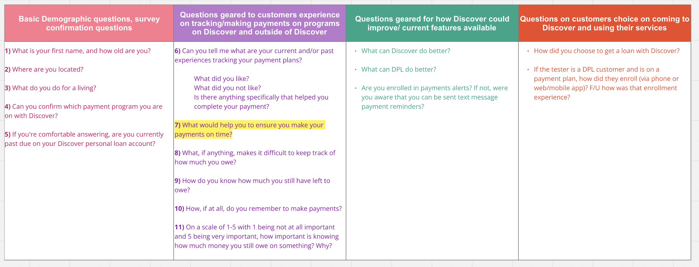
Our first goal was to understand users' current relationship with these loan assistance programs. We interviewed 5 users through moderated tests and aimed to identify pain points users experience while enrolled and explore how best to showcase their enrollment on mobile to better serve their needs
Key Findings
- Users feel discouraged and embarrassed about being on a loan assistance program.
Design Question: How might we add elements of delight and encouragement to the design to help users feel more motivated and supported throughout their program journey? - Users are confused about the program they are enrolled in, unsure of its details or their current progress.
Design Question: How might we onboard users to easily view the specifics of their enrolled program, along with clear, accessible progress indicators? - Users commonly check their account through Discover on their phones.
Design Question: How might we implement mobile functionality for this feature, enabling users to track their progress seamlessly on their phones without needing additional tools?
Establishing User Needs
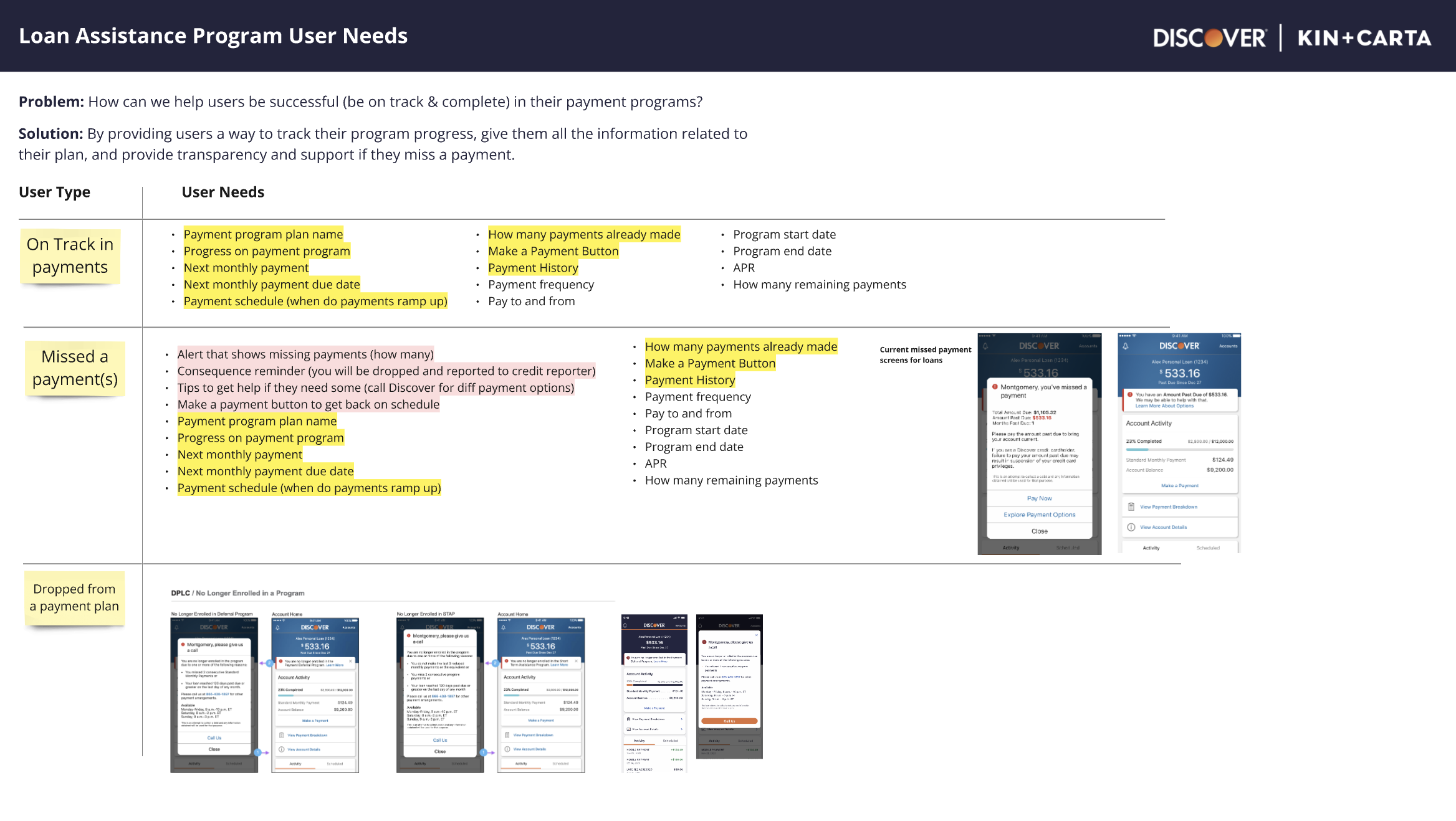
During our initial discovery, we identified different user types who would access this feature: users on track with their payments, users who had missed a payment, and users who were unenrolled from the program before completion.
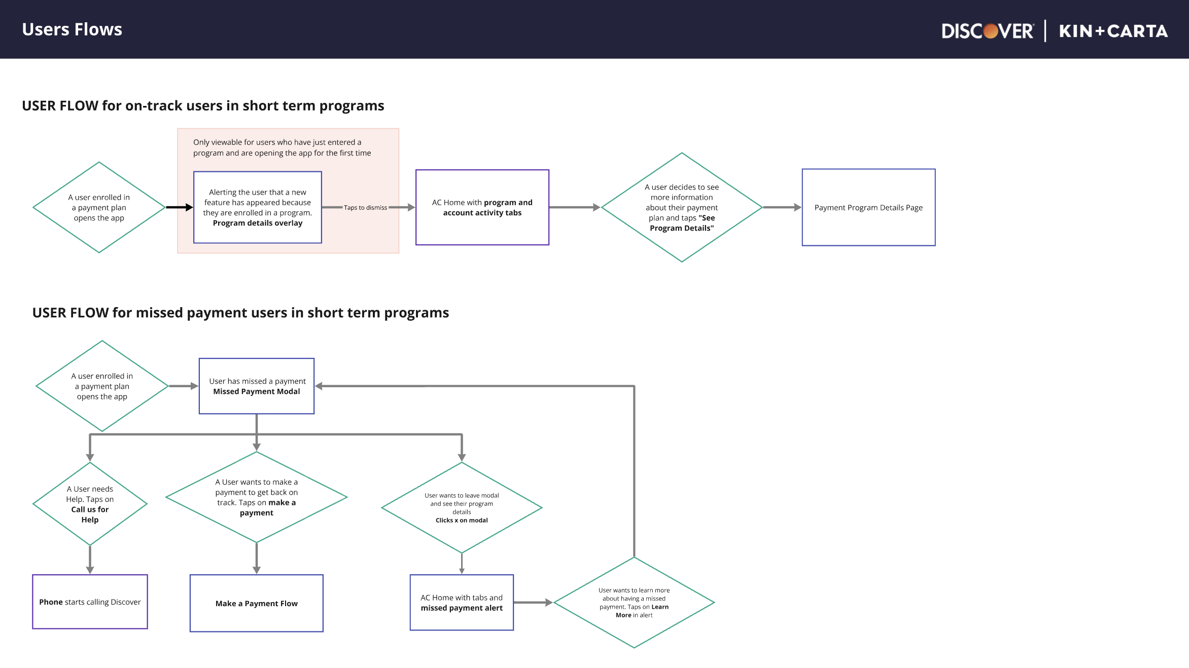
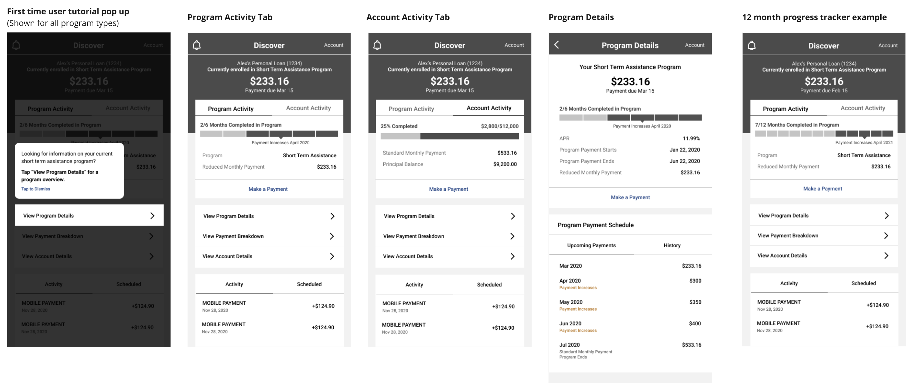
To address the specific needs of each user type, we outlined the exact content requirements for each. We then developed a user flow to visualize how these needs would be addressed within the flow
Why start with Lofi? Know Your Stakeholders
Once we established the user needs, I chose to start with low-fidelity designs. The Discover stakeholders were highly engaged and provided valuable feedback throughout the project. To keep feedback focused and avoid getting ahead of ourselves, we began with low-fidelity designs, which helped the team concentrate on addressing the major themes of the flow before aligning with the design system.
Challenge: Encouraging through Mobile
One challenge we faced in designing this feature was figuring out a way to encouraged user's to complete the loan assistance program in a respectful manner. A part of this challenge was how to do this efficiently on the mobile device within the design system.
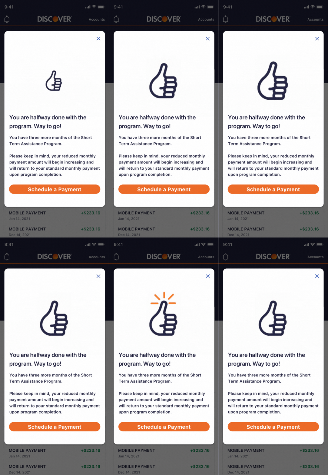
Small Animations to Encourage Users
We researched different ways to users feel encouraged through technology. We found gifs and animations were one of the ways users felt encouraged without feeling too overwhelmed. We needed to make sure what we showed the users aligned with Discover design system as well
Onboarding to the Program on Mobile
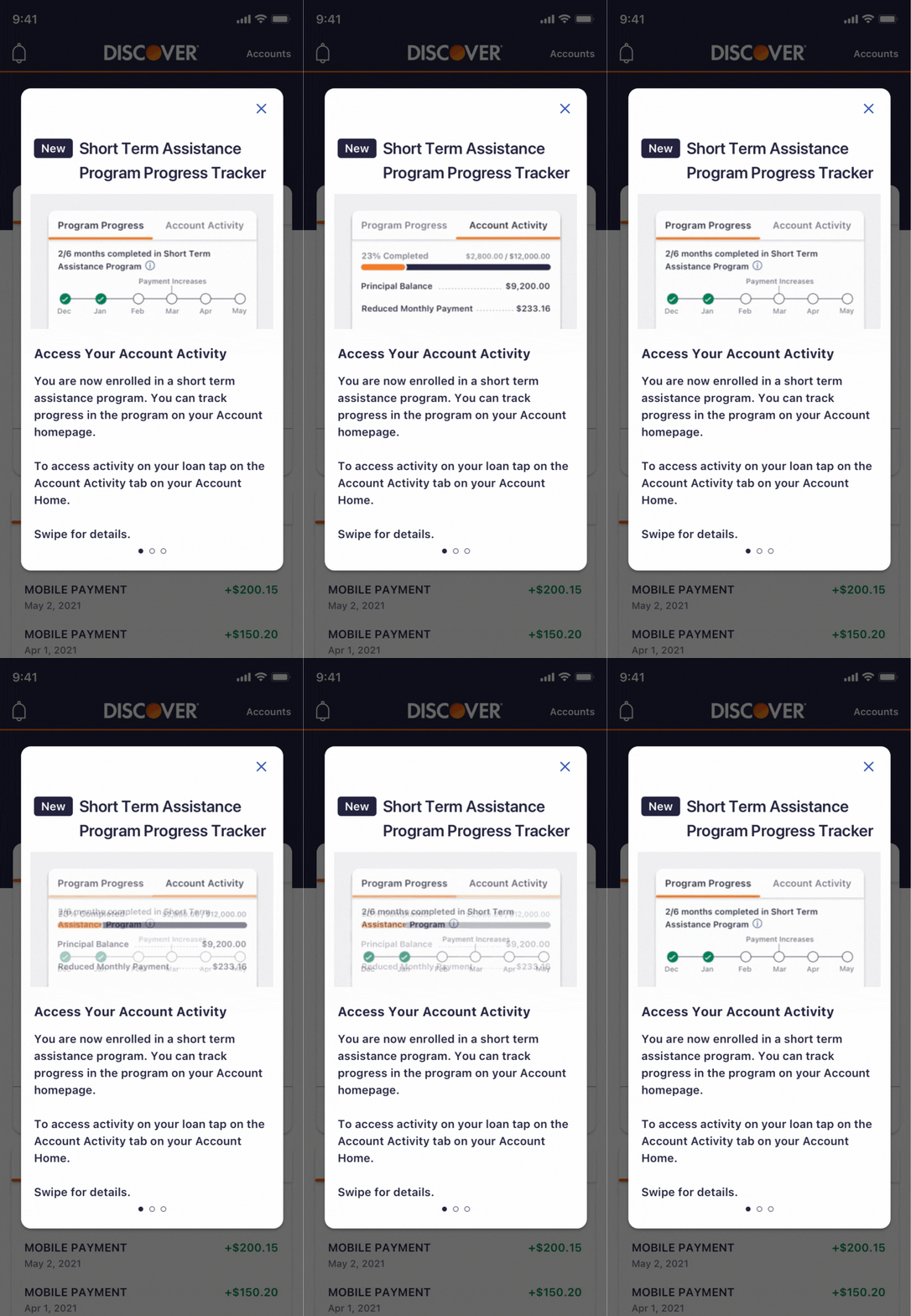
Another goal for this project was to ensure an efficient onboarding process when users opened the app. Since this feature is a new addition to the Discover app, we focused on helping users understand the changes, how the program works, and how to access their account information seamlessly.
Showing Progress to Encourage Progress
A key part of this feature was the progress tracker. We conducted multiple user tests to understand how they expect progress to be displayed. A unique aspect of this tracker is that payments increase in the final months. We also focused on ensuring users clearly understood when this would happen.
Initial Iterations with User Feedback
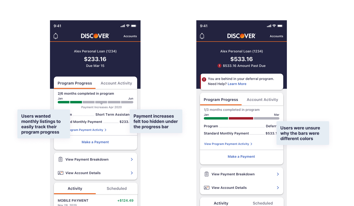
Our initial progress bar didn’t effectively motivate users throughout their loan repayment journey. It was confusing for users to track their progress and connect the colors to successful or missed payments
Final Design and Design Decisions
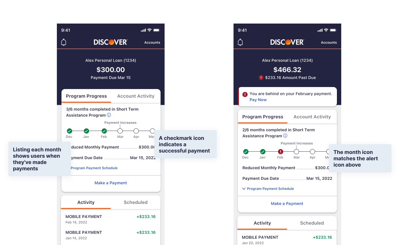
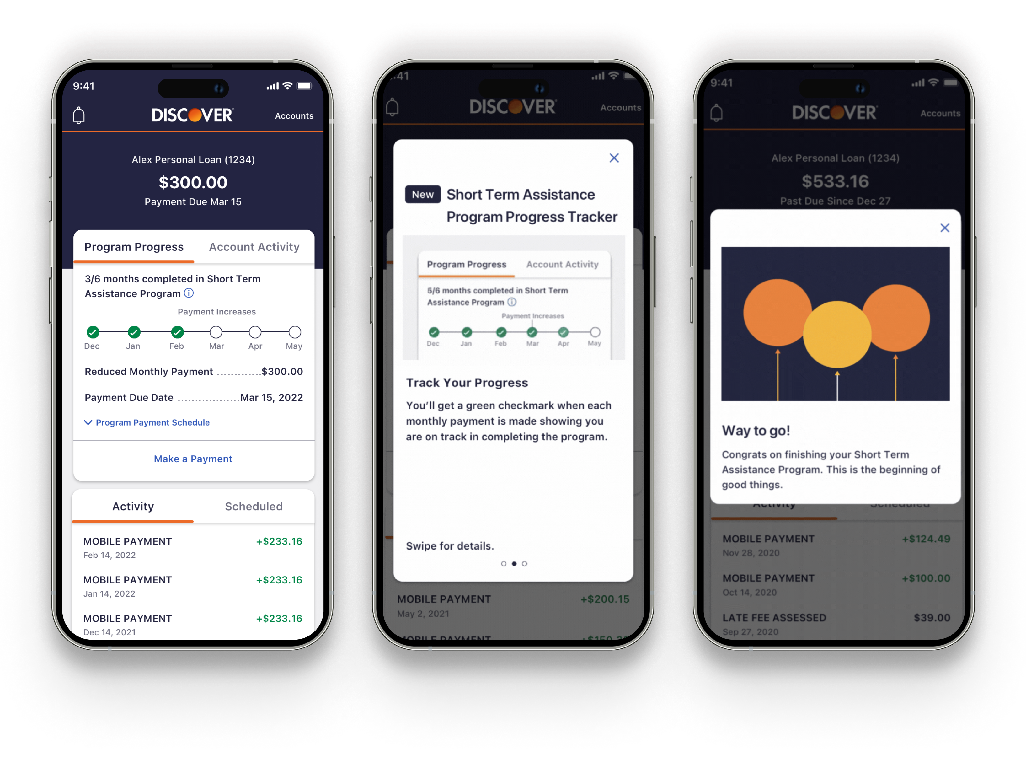
Our final design incorporates user feedback from earlier iterations. We added months to the progress bar to show users where they are in the program and used icons to indicate successful or missed payments. The missed payment icon matches the alert icon above, linking the alert to the progress bar.
Accessing Loan Assistance Program Progress on Mobile
In the end, we created an easy to understand and easy to implement way for users to view their loan assistance progress on their mobile application. This including a way for users to understand their program through a short onboarding procress, view their progress in the program and encouragement throughout the program and upon successful completion. This feature was passed off to developers and successfully implemented in the application
Chat with me! 🤙emily.hoehenrieder@gmail.com
©2020 EMILY HOEHENRIEDER
This website was made with love and many
hours by Emily Hoehenrieder for Emily Hoehenrieder.

