Case Study – Health Insurance Mobile Application Feature
Easing Access and Usability to the OTC Health Insurance Benefit
My Role
On this project, my responsibility was to design the user experience for the mobile application. This involved:
- Collaborating with research to identify key questions for users.
- Iterating based on feedback gathered during research.
- Conducting design research to establish the optimal approach for implementing this feature on a mobile app, while adhering to best practices and patterns.
- Working within the insurance company’s design system
- Working closely with product managers and developers/tech leads to assess the feasibility of various feature aspects.
- Participating in refinements for this feature to assist developers in addressing any open questions about the flow.
- Ensuring a seamless handoff for both iOS and Android applications.
CLIENT
Healthfirst Health Insurance
ROLE & COMPANY
UX Designer
Kin and Carta
TEAM
1 Stakeholder
1 Product Manager
1 Design Lead
1 Mobile Designer (me)
2 Web Designers
2 UX Researchers
Team of ios/android developers
OUTPUT
Mobile Appplication Feature
What is the OTC benefit?
The health insurance company approached our K+C design team with assumptions and feedback received about their OTC (Over-the-Counter) benefit. Our goal was to enhance the overall experience based on this feedback and integrate access to this benefit into their mobile app.
The OTC benefit operates similarly to an HSA card, where members have a preloaded dollar amount. This card allows them to purchase specific OTC items at approved stores. If they make a purchase at a non-approved store without using the OTC card, they can submit a reimbursement request for the items bought.
Current Experience for Health Insurance Members
Members currently access the OTC benefit through an official product not managed by our insurance company. This product has been prone to glitches and lacks our insurance company's branding. The company aims to provide services for this benefit integrated into both their backend and frontend software.
Project Overview
Problem
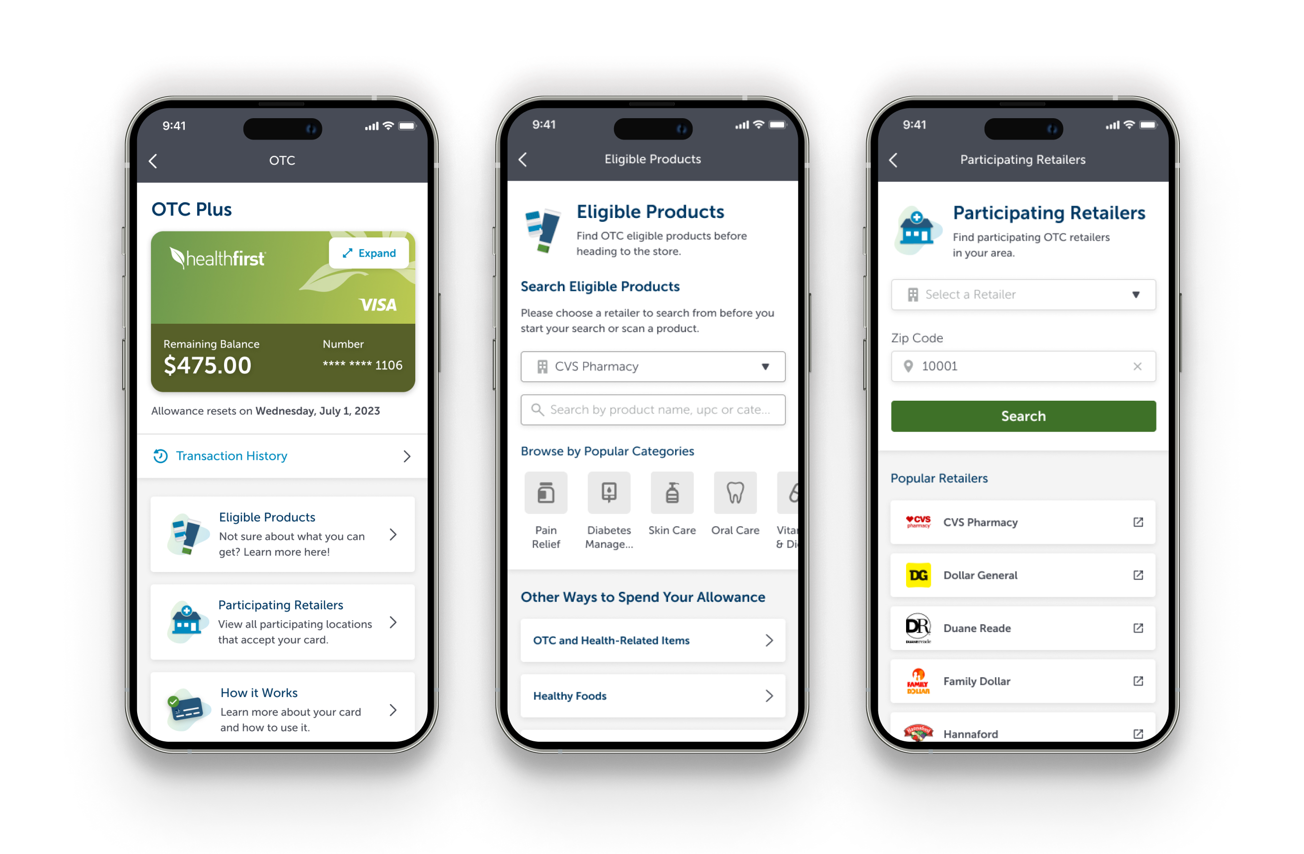
The current OTC experience is plagued by glitches and is hosted by a third-party entity. The OTC benefit is a widely used benefit at this insurance company and members currently don’t have a way to view their OTC balance and approved items/retailers within the company's applications.
Solution
Members require a one-stop-shop feature that prioritizes their most valuable sub-features that can be accessed on the go digitally. It should be glitch-free and intuitively provide access to their OTC benefits through the insurance company's mobile app.
Outcome
The first release of this feature saw an increase in activating the OTC card digitally which resulted in an increase in mobile app downloads. The full feature is still in development.
Evaluating the Current Experience
We evaluated the current experience of our member's using OTC through 8 in depth interviews. The purpose of this research was to understand the current relationship user's have with this helath insurance benefit and where pain points/opportunities exsist in the process.
Initial Research Objectives
- Understand the current OTC experience and the awareness member’s have about the benefit
- Identify feature opportunities
- Determine the level of feature desirability
- Determine which features are better suited to mobile, web, or both
- Better understand the risk to providing incorrect OTC coverage data in the app
Key Findings
Participants lacked awareness of OTC eligible items outside of personal health and hygiene.
Most members currently shop at independent pharmacies and other retailers despite having access to an online OTC store, GrowNYC Markets, and fresh produce delivery services
Participants used their OTC card in stores.
Some noted that retail clerks typically were not familiar with the OTC card.
Participants showed interest in this feature
on mobile
“My phone is immediate. Phones are extensions of our bodies now” - Member
Most participants did not recall learning about more ways to use their card after activation.
One participant said they learned they could use the card for produce after calling OTC network for a different problem.
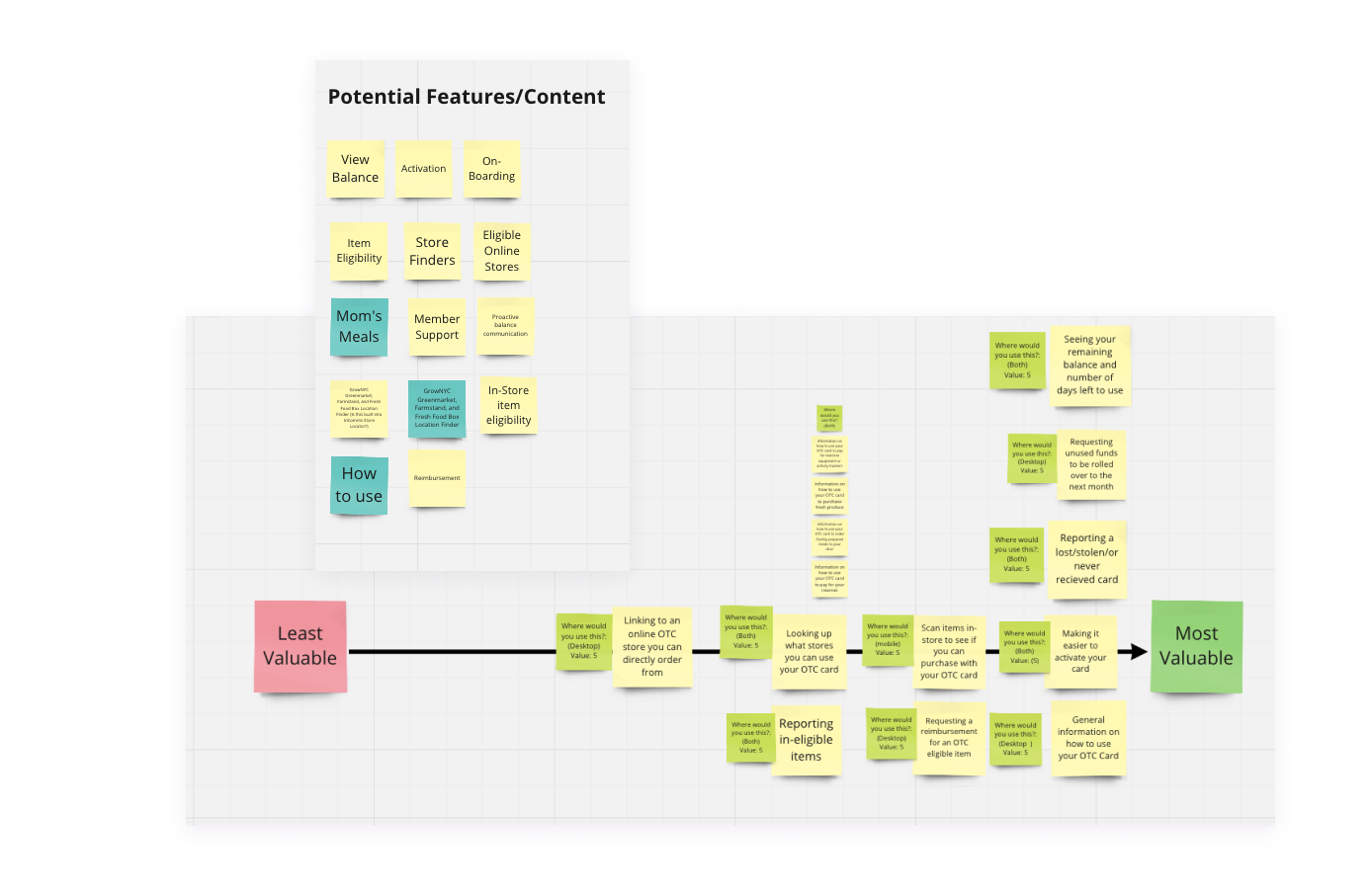
Prioritizing Features
We determined the MVP for this project by assessing the API capabilities and interviewing stakeholders to understand business priorities, all while aligning to member insights from the initial research.
Utilize past research findings to pinpoint and highlight valuable features for members.
Leveraged Miro to delve into user interviews, mapping out valuable features. Recognizing that an MVP approach may not encompass all user needs in the initial version, this method allowed for a more thorough exploration.
Identify capabilities of the OTC API
Engaged in discussions with developers to determine the feasibility of implementing features for this specific aspect, considering the capabilities of the OTC network API.
Take into account business priorities
Increasing digital forms for members is a top business priority for this company. This strategic move aims to raise their STAR rating, ultimately securing additional funding from the federal government for Medicare.
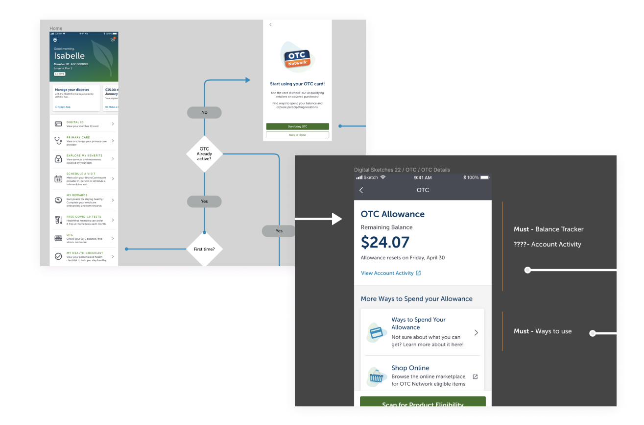
MVP Features
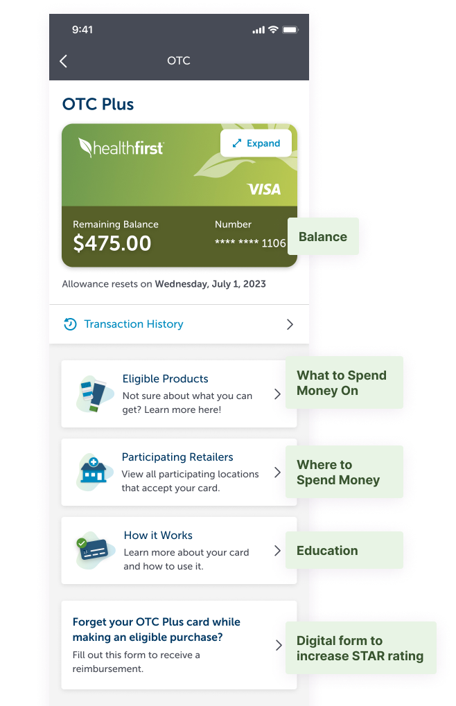
We identified the most valuable sub-features we need to include in the design address the following needs of the members and the business:
- What to spend OTC money on
- Where to spend OTC money
- Balance of OTC money
- Reimbursement form
- Education around OTC
Challenge: Working with Difficult API
One challenge we faced in designing this feature was working with the OTC API. The API was finicky and operated within inconsistent rules and limitations.
How We Managed
Constant Communication with Developers and Product
We worked constantly with developers and product to parse through the API and find the where some of the API limitations came into place
Always Check Feasibility
Part of our constant communication with developers was checking feasibility. We would constantly send them prototypes to make sure what we were designing was feasible.
Thinking Creatively
Once we understood the limitations of the API and that the developers were unable to change major aspects of it, we thought of creative UX solutions to make sure the feature was delvired on time
Building a Testing a Concept
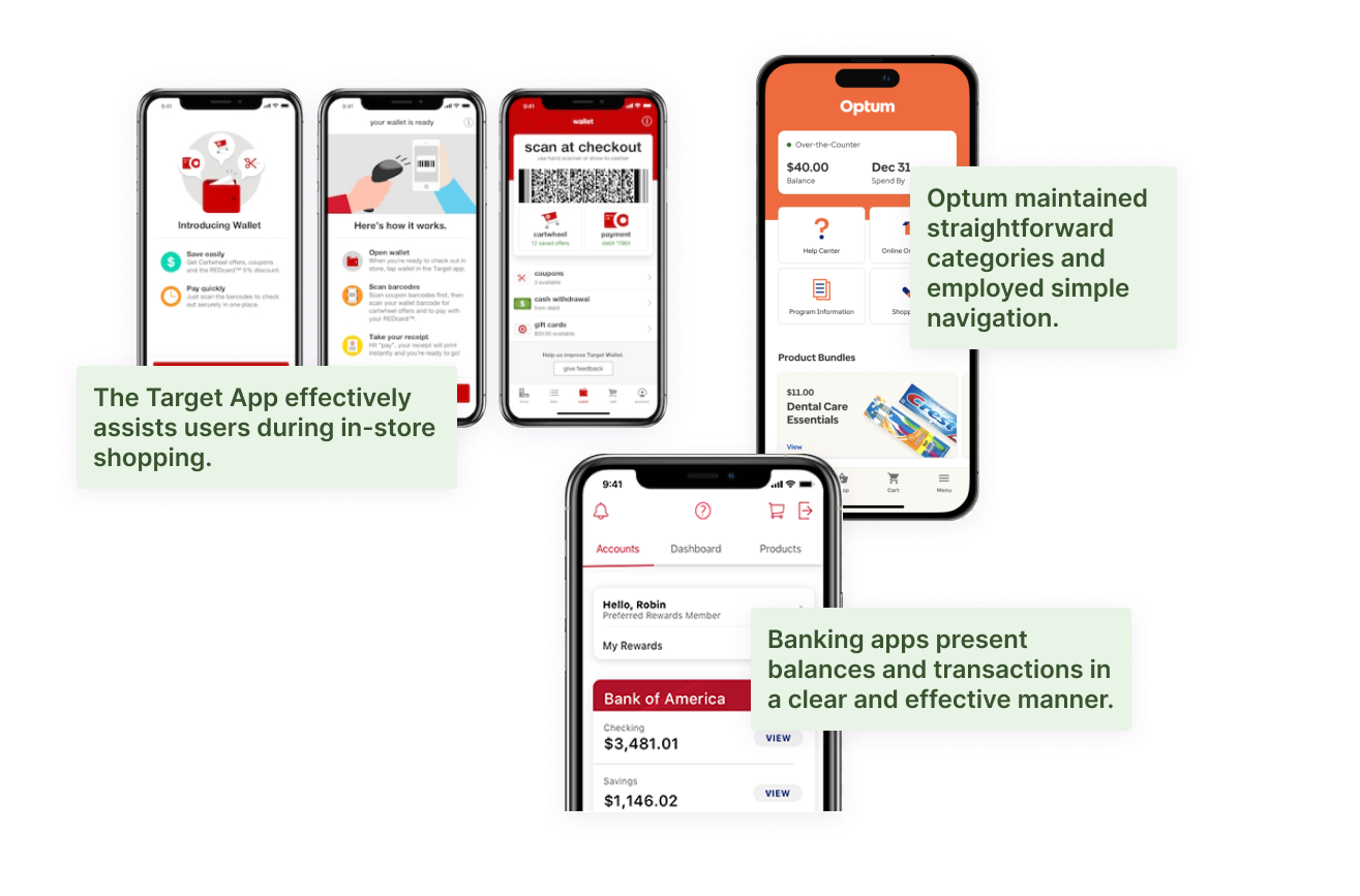
Once we pinpointed an MVP approach, our focus shifted to crafting a user flow and conducting a competitive analysis of similar features. This process culminated in a concept design, which was then prepared for usability testing.
Designing the Concept
Testing a Concept
Upon finalizing the concept design, we conducted usability testing by soliciting feedback from users. We emphasized user input throughout the entire process. The primary objectives of the testing were to validate the feature's usability and affirm the identification of valuable features from the initial research. The results were positive, with the most crucial features we had previously identified being confirmed.
Continuous iteration based on feedback was a key aspect of our research rounds. Following the concept testing, we gained deeper insights into user preferences and values, which informed the next round of design. We presented this evolving design on a weekly basis, collaborating with developers and the product manager to refine stories and discuss feasibility during this period.
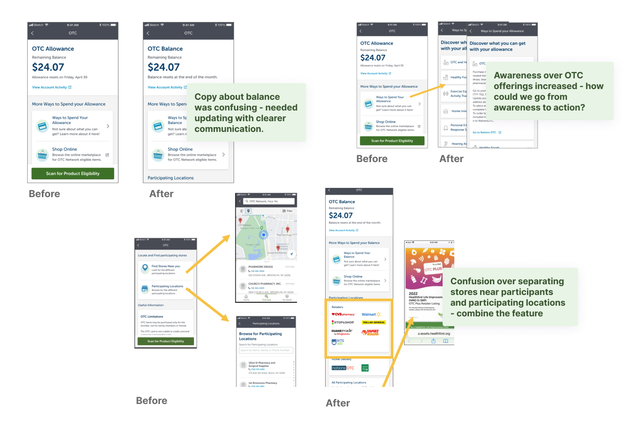
Design Decisions
Simple navigation
As mentioned in the feedback on the preceding slide, our second round of testing revealed some confusion regarding the feature's architecture. To address this, we opted to prominently feature the three categories identified by users as the most valuable on the homepage of this feature.
Mimicking Real Life
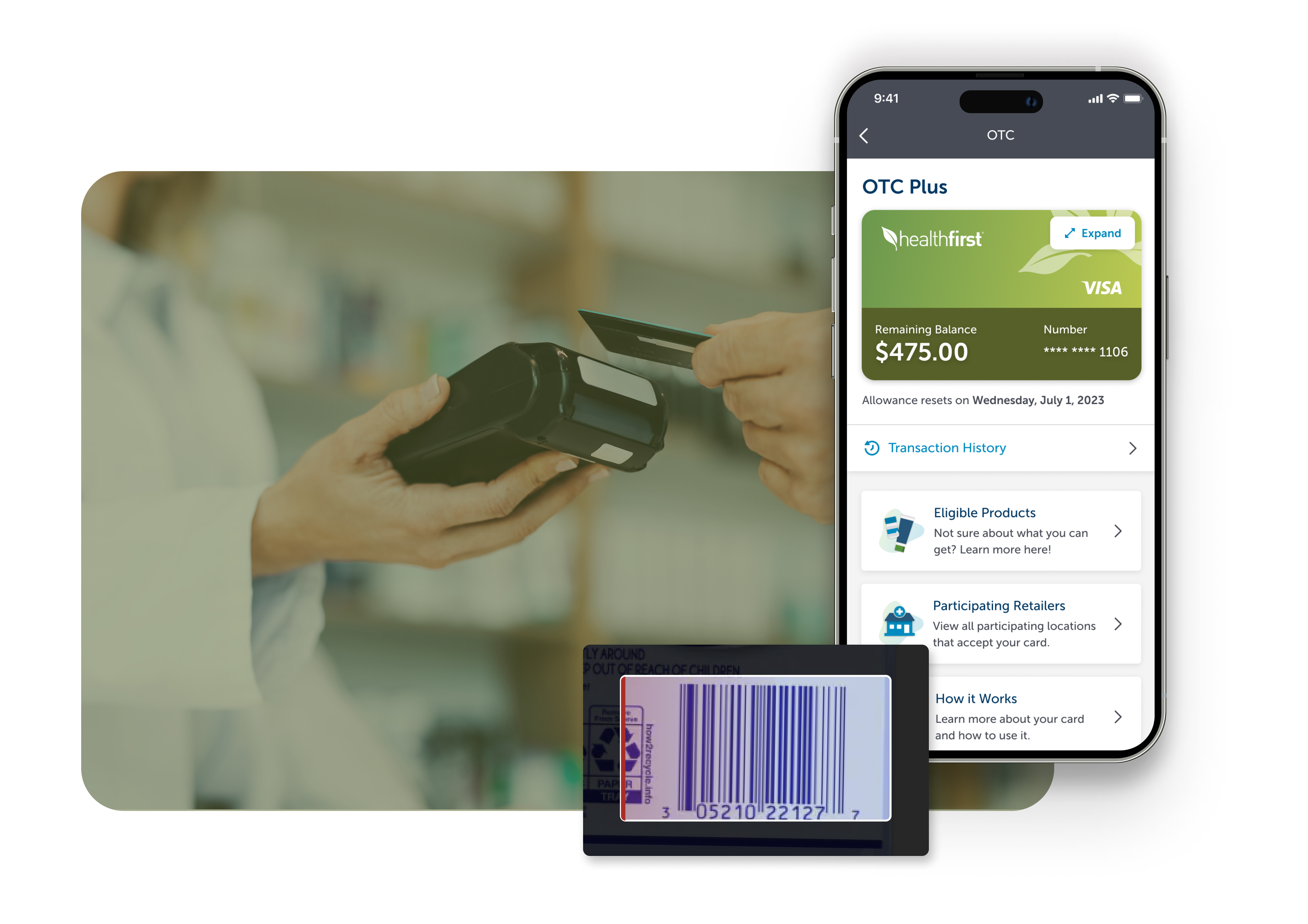
In the final version, we modified the card design to closely resemble the actual card users will receive. This adjustment aims to reduce cognitive load and swiftly convey to users that they are accessing their OTC benefit.
Making the Most of Mobile
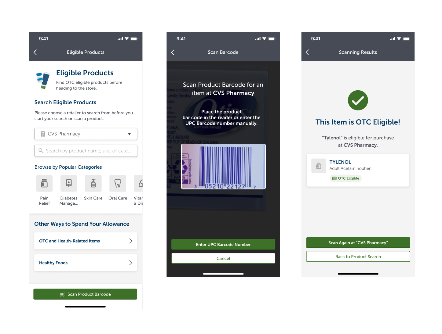
Product Scan
We knew from feedback this feature was going to be a great asset to users on the mobile app by helping them while in store. Uncertainty about which items were eligible for OTC caused issues for users. During interviews, some users expressed embarrassment when they discovered at the checkout that their item was not eligible.
Collaborating with developers, we introduced a product scan feature in the app. Members can now scan a product barcode at a store, checking its OTC eligibility and ensuring they only purchase items eligible for OTC with their OTC card.
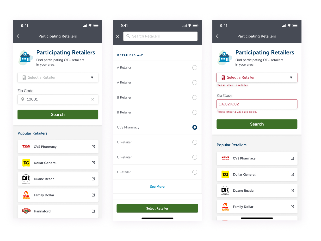
A One-Stop-Shop for the OTC Benefit
In the end, we created a one-stop shop for users to access the OTC Benefit on the Healthfirst application on mobile. They were able to view their account balance, find eligible products, view participating retailers, learn about their visit and fill out a digital form for reimbursement all within the Healthfirst application.